The gallery of misleading charts
Misleading charts, collected and explained.
Real charts with truncated axes, cherry-picked timeframes, and distorted proportions. Each comes with a short account of the technique it uses and what the same data looks like drawn plainly. A new chart is added every day.
Same data, two stories
Misleading
94
95
ThemUs
+1 point, drawn 3× taller.
- 72
- charts on the wall
- 50
- techniques catalogued
- 1
- new chart every day
On the wall
The most recent additions to the gallery — one new chart every day.
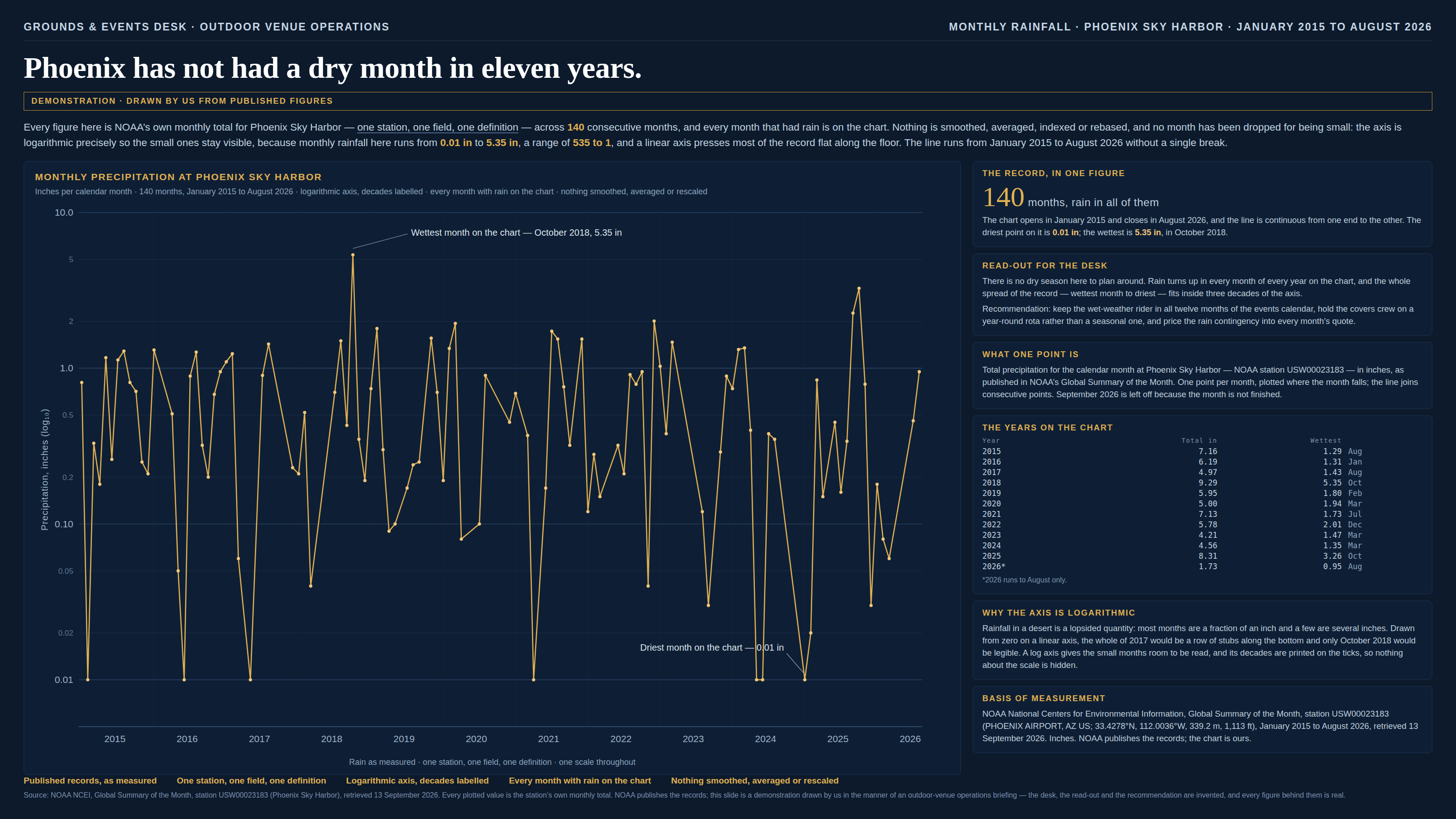
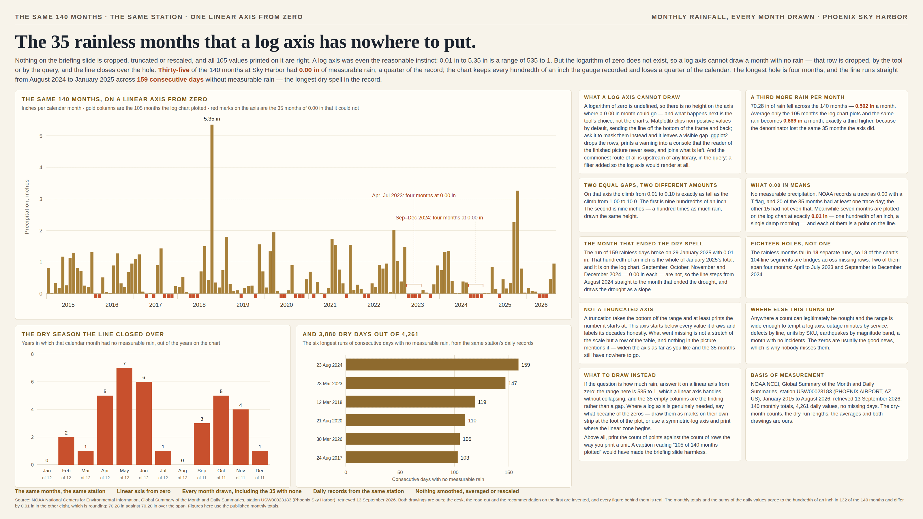
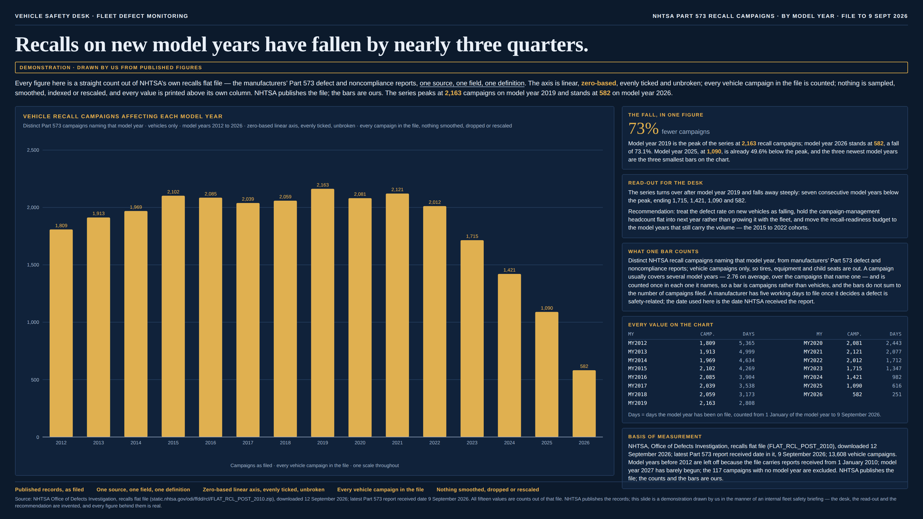
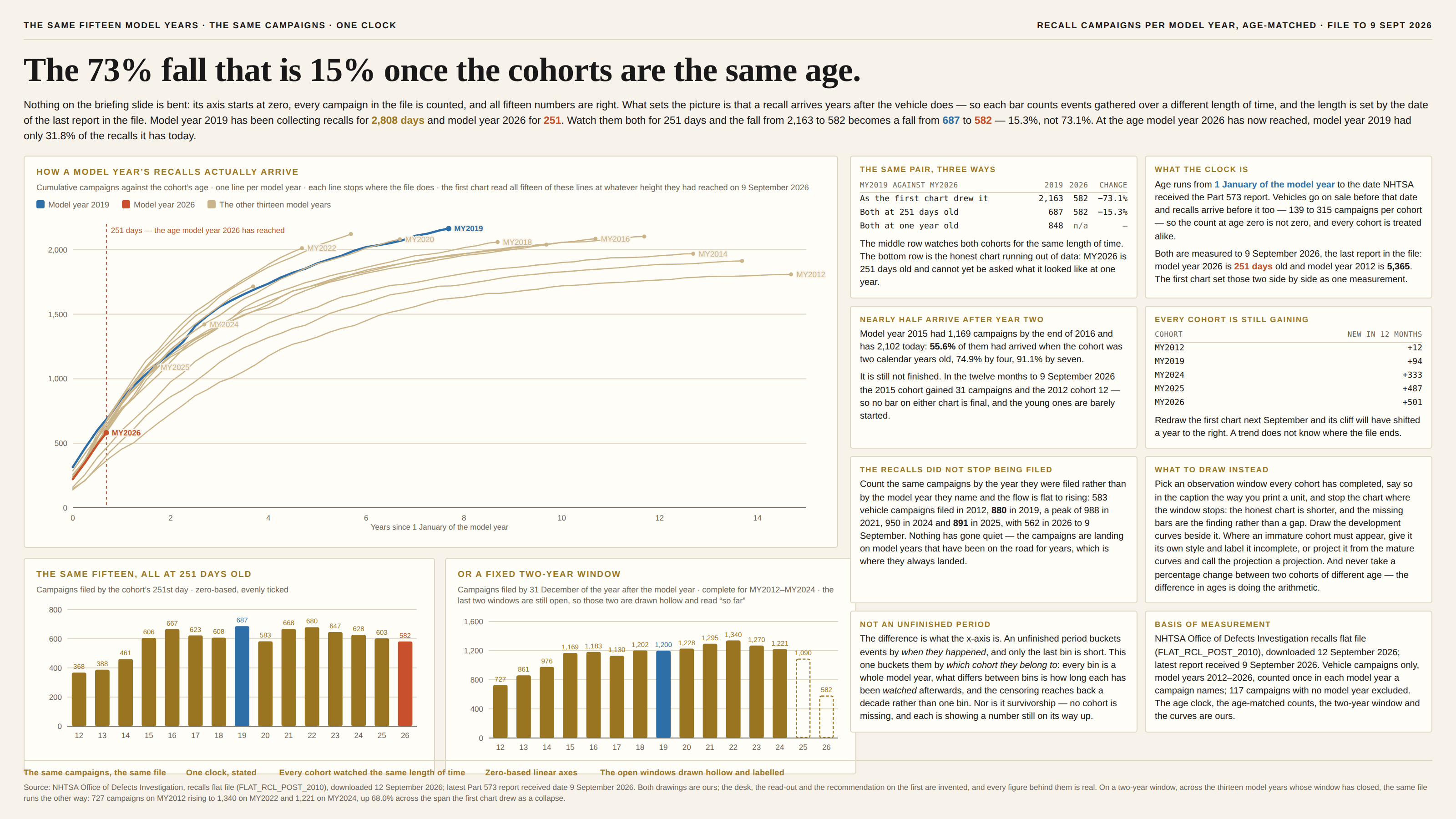
The field guide
50 techniques, grouped by type. Every chart in the gallery is tagged with at least one, and the same handful account for most of them.
Axis crimes
Where most chart lies begin: the humble axis, bent until the data confesses.
- The truncated axisA 3% difference, presented as a landslide.
- Dual y-axesTwo axes, one narrative, infinite flexibility.
- The inverted axisUp is down. Less is more.
- Uneven intervals1990, 1995, 2000, 2004, 2006, 2007 — evenly spaced.
- The log scaleEvery gridline is another ×10, and the eye reads them as equal steps.
- The broken axisThe zero is still there. The middle is missing.
- The clipped axisEverything taller than the frame is drawn exactly as tall as the frame.
- The aspect ratioSame numbers, same axis, same range — and the slope is whatever shape the box is.
- The rebased indexEvery line passes through 100 on a date somebody chose.
- The logarithmic unitThe axis is linear. The unit is already a logarithm.
Size & scale
When 2× somehow looks like 8×. Your eye reads ink, not numbers.
- The area illusionTwice the value, four times the ink.
- Gratuitous 3DThe slice in front always wins.
- The impossible pie70% + 63% + 60% = one pie chart.
- The radar chartA spoke twice as long paints four times the ink.
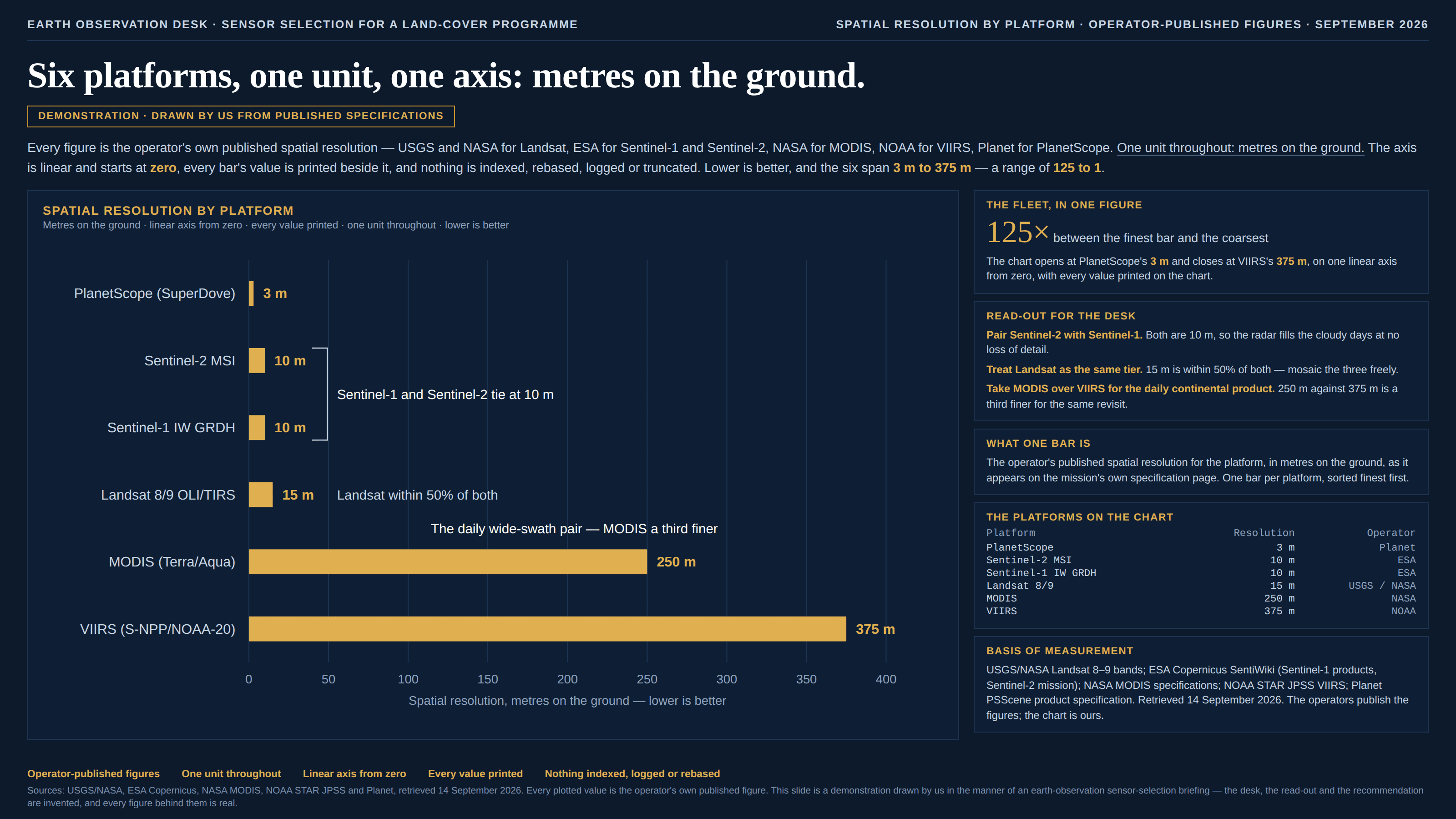
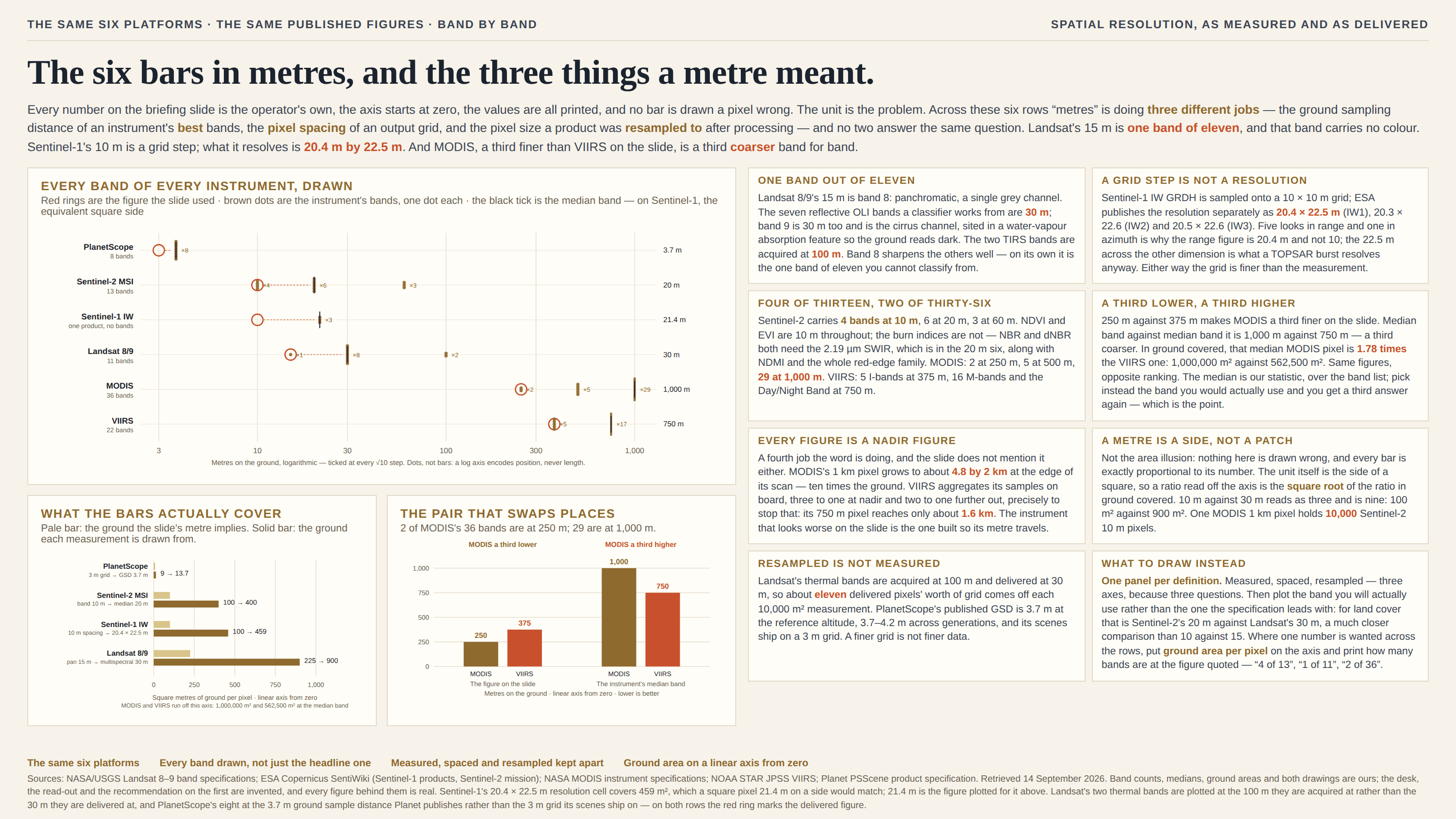
- The false common scaleSame word on the axis. Not the same thing being counted.
- The bar with no true zeroThe axis starts at zero. The quantity doesn’t.
- The stack with one baselineOne band starts at zero. The rest float on whatever is underneath them.
- The word cloudThe biggest word is usually just the longest one.
- The map projectionGreenland is not bigger than Africa. The map is.
- The treemapThirteen rectangles, no axis, and one area judgement per comparison.
- The free-scale small multipleSix panels in one grid, six different rulers.
- The Sankey ribbonA ribbon is a length that has been bent, and two of them are never added by eye.
- The rainbow colour mapOne degree buys seventeen units of colour here and half a unit over there.
- The gaugeOne number, one needle, and two limits somebody typed in.
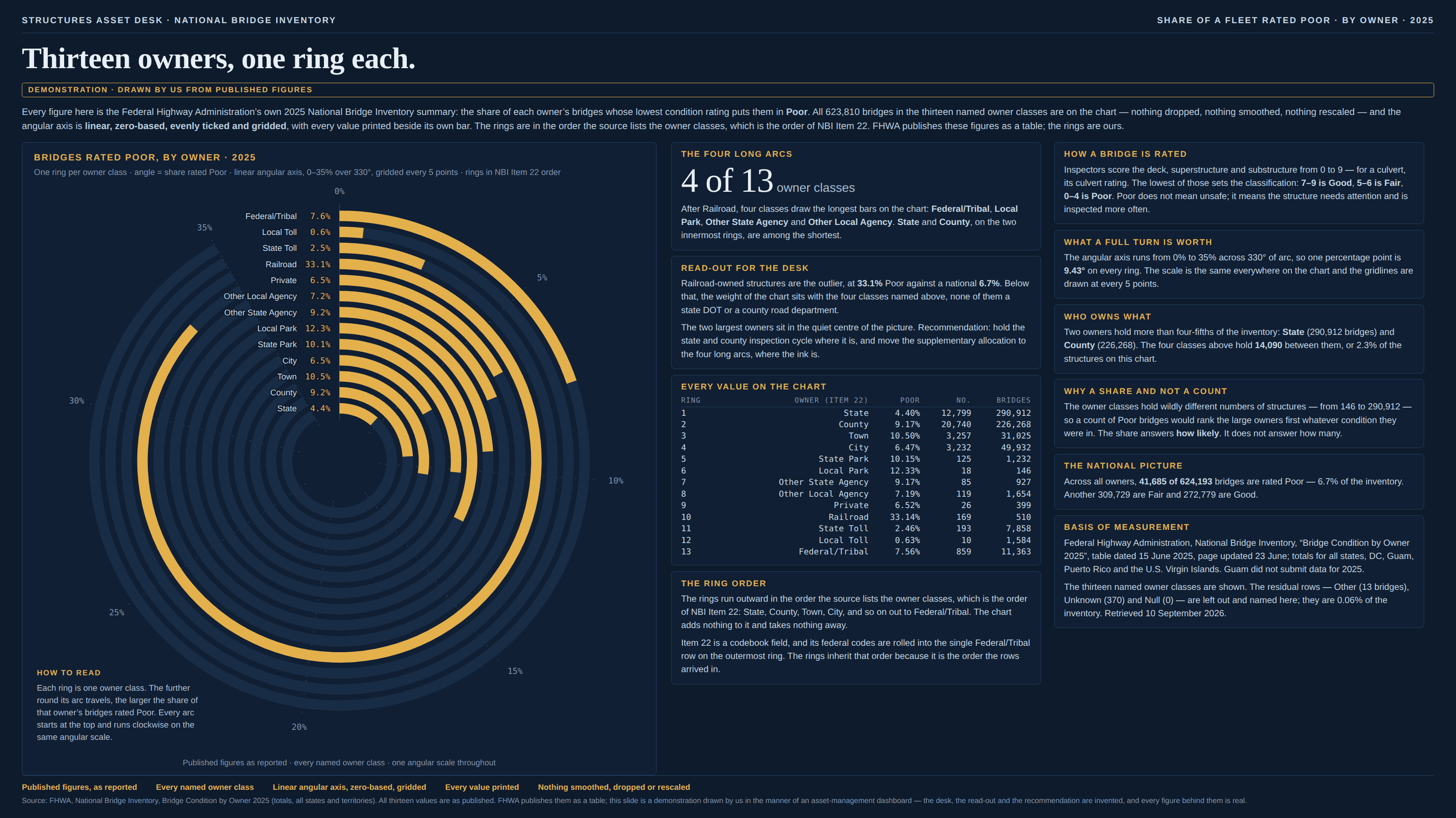
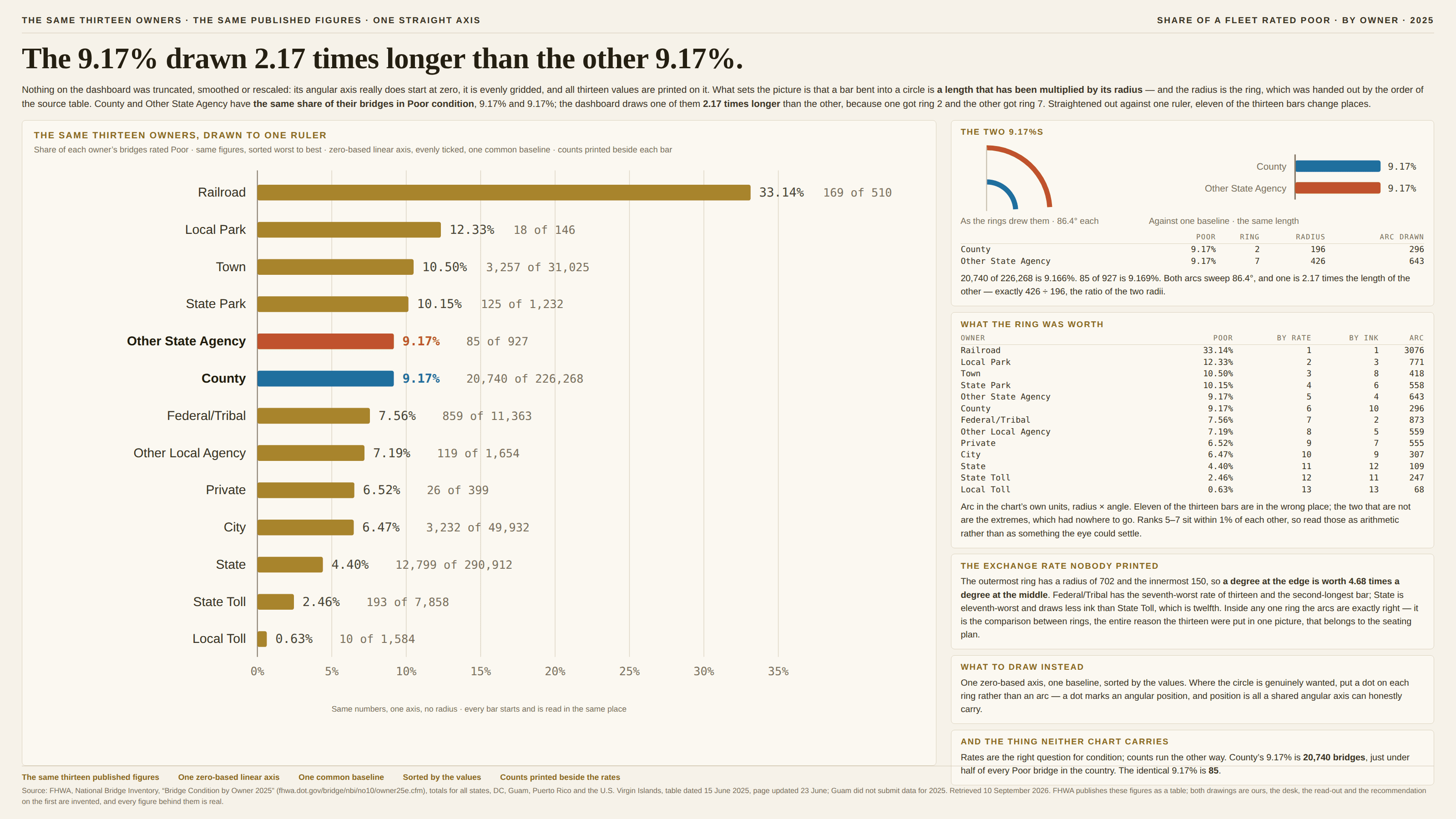
- The radial bar chartThe value sets the angle. The ring sets everything else.
Cherry-picking
The data shown is real. The data missing is the story.
- The cherry-picked windowThe trend depends on when you press start.
- The convenient comparisonWe’re #1 — among the competitors we chose.
- Survivorship biasPlotting only the planes that made it home.
- The ever-rising cumulativeA metric that literally cannot go down.
- Regression to the meanPick the extremes and they improve without your help.
- The self-selected sampleTen thousand replies, every one of them from somebody who felt like replying.
- The filter that invents a trade-offTwo things that go together, sliced until they look like a choice.
- The late denominatorStart counting at step three and everybody who failed at step two leaves the fraction.
- The size-biased countA school of forty counts once. So does a school of four thousand.
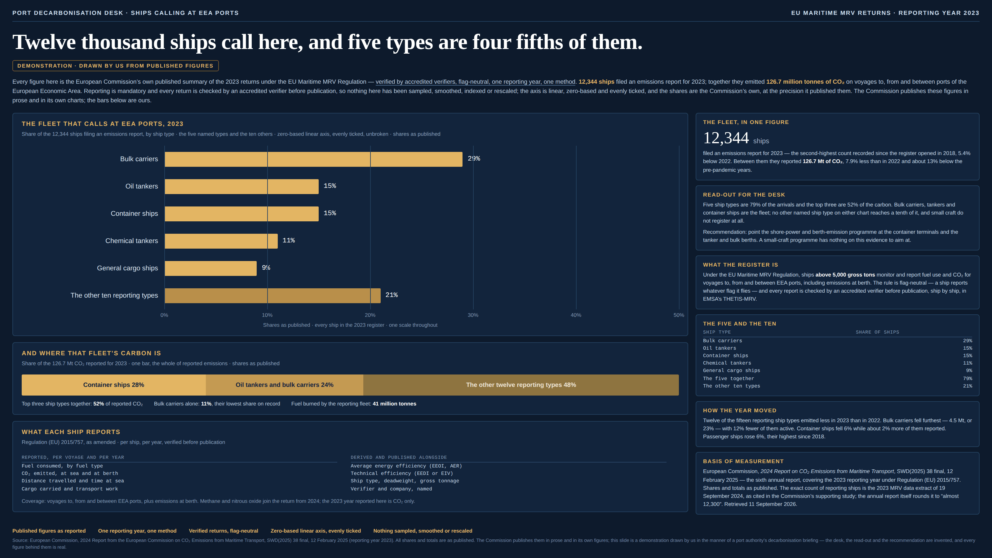
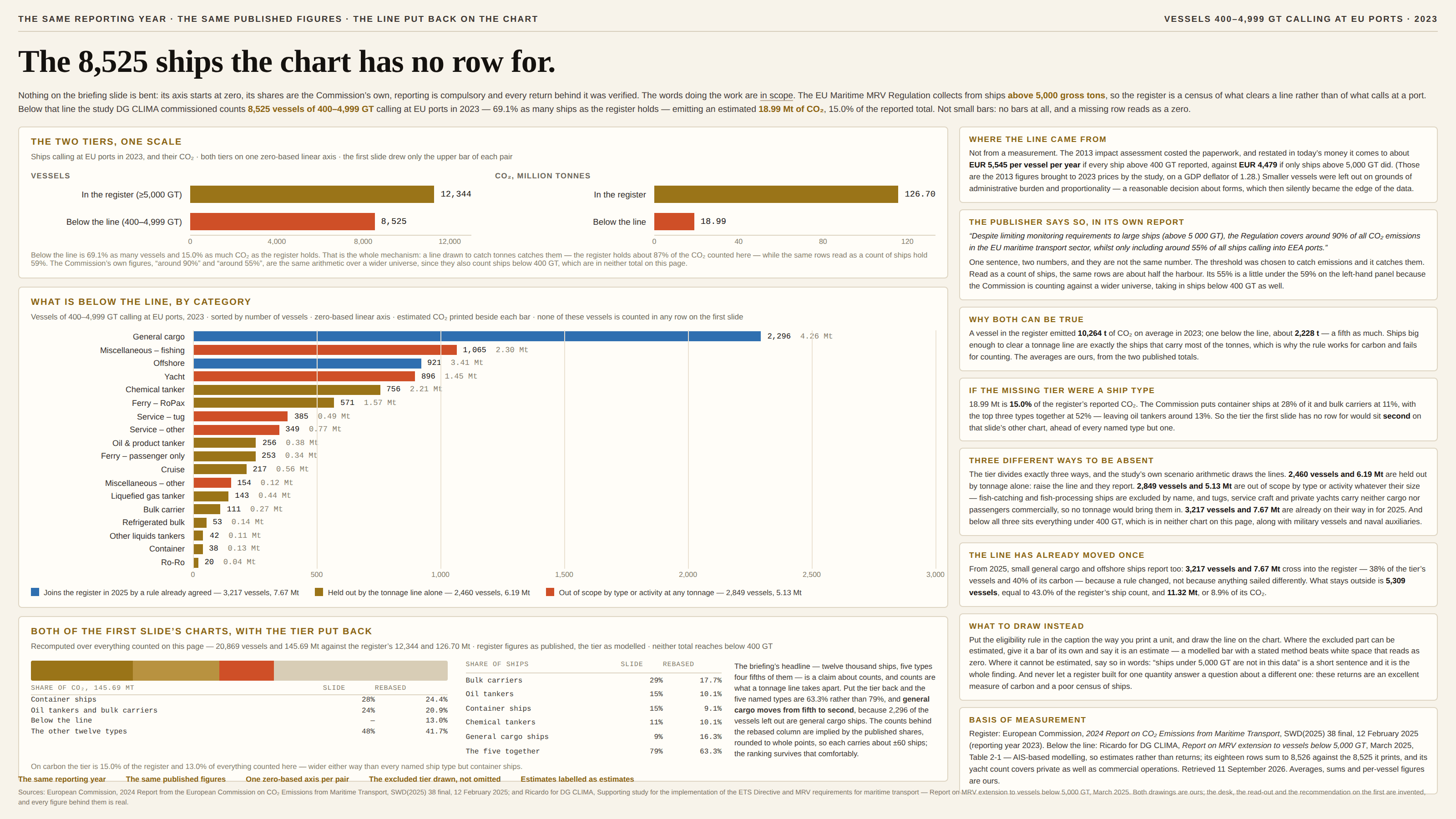
- The reporting thresholdEvery row on the chart cleared a line somebody drew. What didn’t clear it isn’t zero — it’s absent.
- The immature cohortEvery bar is a whole year. Only the old ones have had time to finish.
Framing & context
Technically true, practically misleading.
- The missing denominatorMore of everything happens in California. More people live there.
- The shrinking yardstickEvery year is a record year when the dollar does the climbing.
- Spurious correlationMargarine consumption and the divorce rate in Maine: a love story.
- Strategic binningThe map whose color breaks were drawn after the data arrived.
- Simpson’s paradoxEvery group goes one way. The total goes the other.
- The redefined measureThe step in the line is the year the definition changed.
- Relative risk without the baseline“Raises your risk 18%.” Of what, from what, by how many?
- The missing base rateCatches four in five. Wrong seven times in ten. Both are true.
- The count that measures the lookingThe line rose because the instruments did.
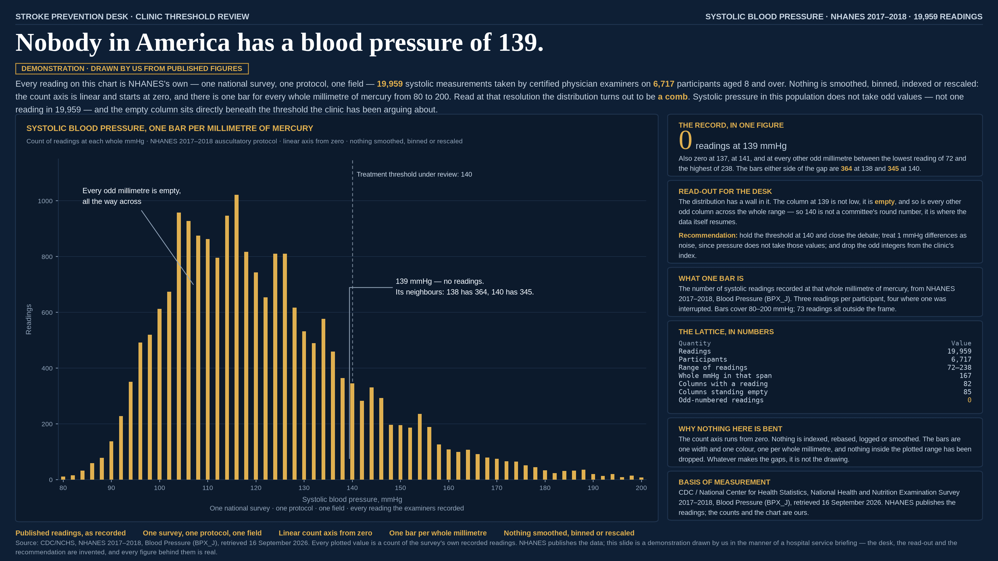
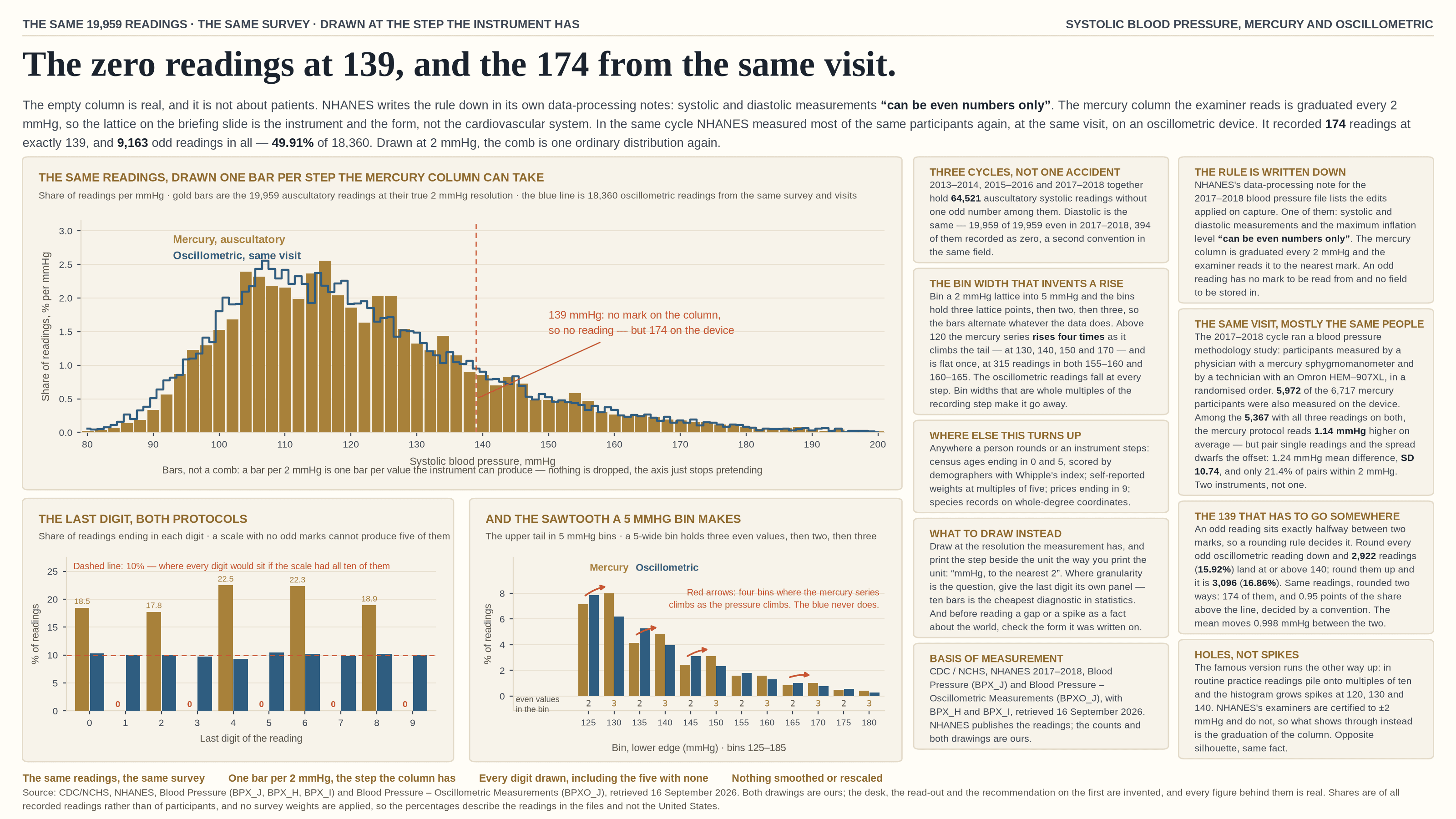
- The heaped digitThe spike is where the pen stopped, not where the world piled up.
- Phantom precisionn = 6, error bars sold separately.
- The unfinished periodThe last bar is short because the period is young, not because anything changed.
- The seasonal swingThe biggest move on the chart is the one that happens every year.
- The extrapolated trendThe data stops. The line does not.
Most misleading charts aren't malicious.
Software defaults, deadlines, and unchecked axes account for more of them than bad intent does. The write-ups here describe the techniques rather than the motives — the distortion works the same either way, and so does spotting it.
About the project