All techniques
Axis crimes
The clipped axis
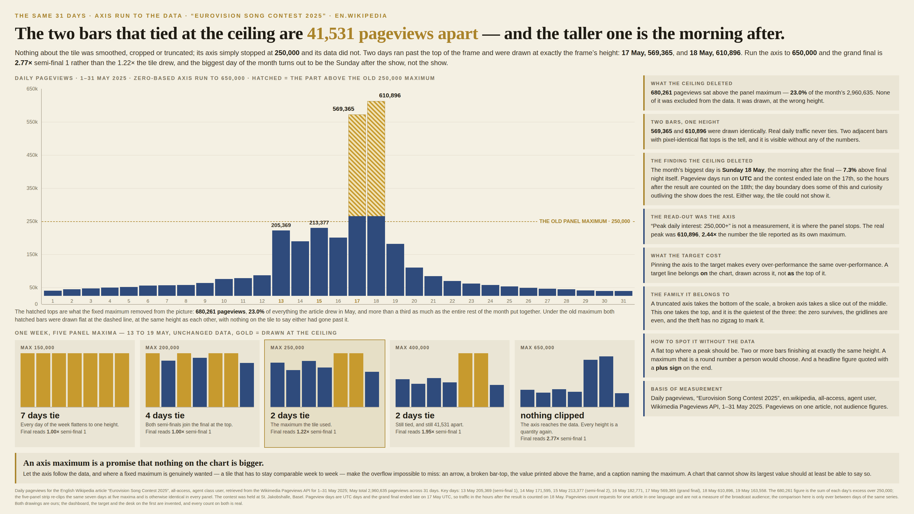
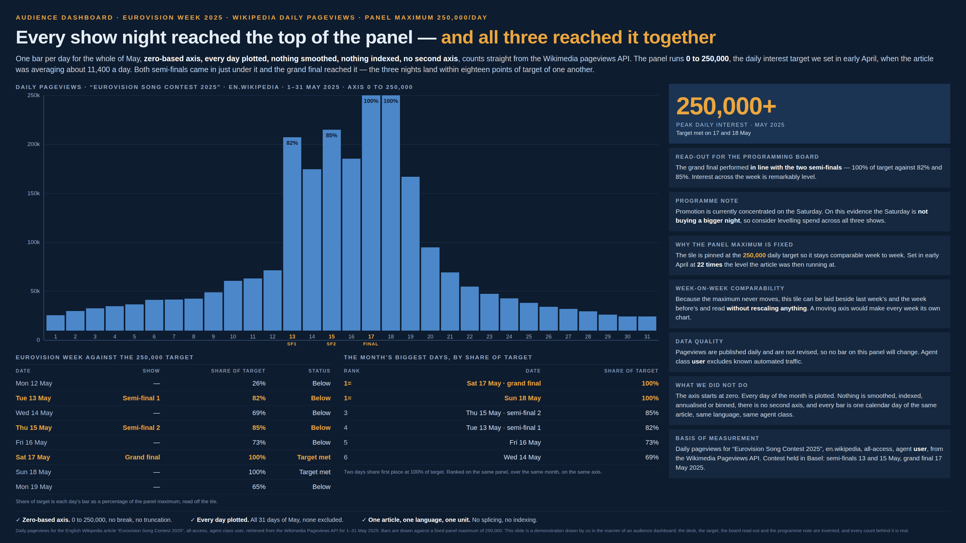
Everything taller than the frame is drawn exactly as tall as the frame.
a.k.a. the ceiling · fixed axis maximum · the axis cap · hard max · ylim · clipped bars · the flat top · off the top of the chart · the capped colour scale
A truncated axis takes the bottom of the scale and a broken axis takes a slice out of the middle. This one takes the top, and it is the quietest of the three, because nothing about the axis looks wrong: the zero survives, the ticks are round, the gridlines are evenly spaced, and there is no zigzag to mark the theft. What has gone is the range above the last tick. The maximum was fixed — a dashboard setting, a target line, a template, a limit typed once and never revisited — and the data was never asked whether it fitted. Every value that runs past the top is drawn at the top, so above the ceiling the mark stops being a measurement and becomes a threshold test: all quantities up there are the same quantity. How it fails depends on the mark — bars, columns, gauges and clamped colour scales arrive flat against the frame, while a line simply leaves it and comes back, which is louder but just as unmeasurable. And unlike the other two, it leaves the reader nothing to work with, because what it removed is not on the chart to be noticed — a truncated axis at least prints the number it starts at, while a ceiling’s whole effect lives in values the picture never mentions.
How to spot it
- Flat tops. A bar or a line finishing exactly level with the top of the plot is not a value, it is a collision.
- Two or more marks finishing at identical heights. Real measurements rarely tie; a ceiling makes ties in bulk, and the tie is visible without knowing a single number.
- Read the top tick and ask who chose it. A maximum that is a round human number — 100, 250,000, 100% — was set by a person or a template. Data does not land on those.
- A “peak” or “max” read-out equal to the axis maximum, or a headline figure quoted with a plus sign on the end. That is the frame reporting its own height.
- A target, capacity or service-level line that is the top of the chart rather than a rule drawn across it. Pinning the axis to the target makes every over-performance the same over-performance.
- The tallest part of the series arriving flat and wide where the rest of it is spiky. Peaks are pointed; plateaus at the frame edge are usually the frame.
- Ask whether the axis is fixed on purpose. Dashboard tiles pinned so they stay comparable week to week, small multiples sharing one hard maximum, gauges that stop at 100%, heat maps with a clamped upper bound — every one of them is a ceiling waiting for a big day.
- In code, the setting has a name: Excel’s fixed Maximum on the value axis, Grafana’s hard Max, a vmax on a colour scale, matplotlib’s set_ylim — which leaves the bar drawn and cut off at the frame. In ggplot2 the two spellings do different things, and both are worth knowing: scale_y_continuous(limits = …) drops the offending rows altogether, while coord_cartesian(ylim = …) merely zooms.
The fix
Let the axis follow the data. An axis maximum is a promise that nothing on the chart is bigger, so the default is to run it past the largest value and let the giant be a giant — if that squashes the rest of the series into the bottom of the frame, the squashing is the finding, and it is the finding the ceiling was hiding rather than solving. Where a fixed maximum is genuinely wanted, and often it is — a tile that has to be comparable week to week, a grid of small multiples that has to share one ruler — keep it and make the overflow impossible to miss rather than impossible to see: break the top of the mark with a ragged or arrowed edge, print the value above the frame, and say in the caption what the maximum is and how far past it the series went. A clipped mark that announces its own clipping is an honest chart with a footnote; a clipped mark that does not is a wrong number drawn to scale. Keep targets off the axis: draw the target as a rule across the plot, where a bar can be seen beating it and by how much, rather than as the edge the bar arrives at. Never let a read-out be computed from the drawing — a “peak” that equals the axis maximum is a fact about the template, and the arithmetic should always run on the data rather than on what survived being plotted. And watch for the same move in colour, where it is commoner and quieter still: clamping a scale’s upper bound paints every value above it in one shade, which is a flat top with no silhouette to give it away.
In the gallery