All techniques
Framing & context
The count that measures the looking
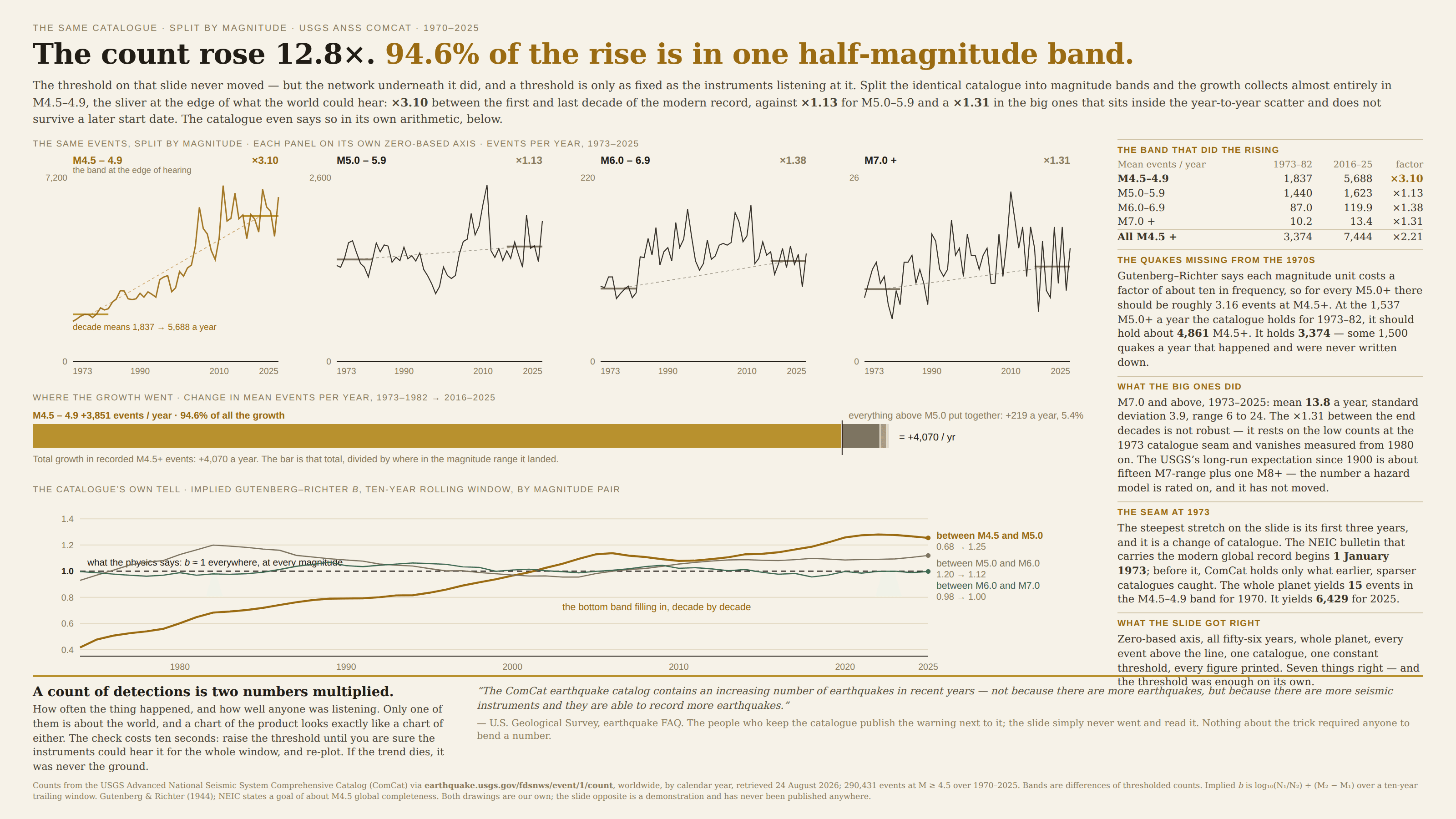
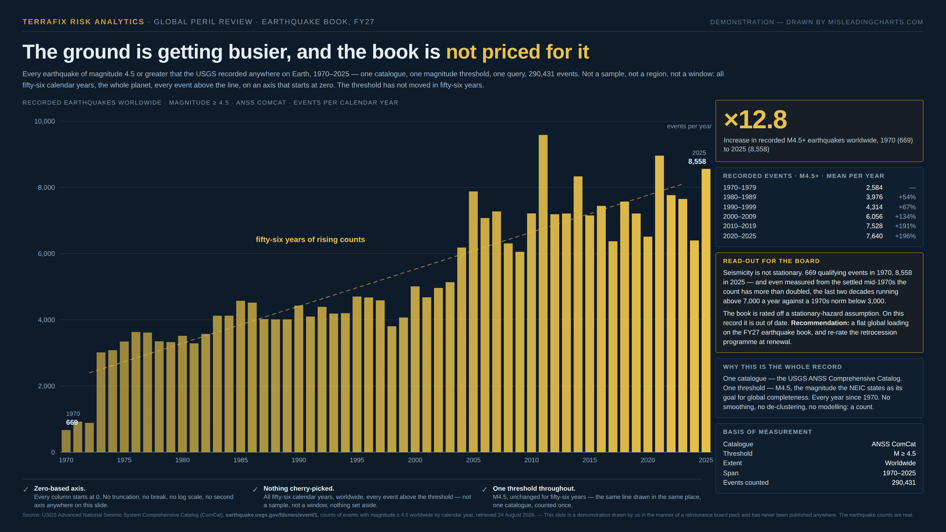
The line rose because the instruments did.
a.k.a. ascertainment bias · surveillance bias · detection bias · catalogue completeness · the reporting artefact · observation effort · overdiagnosis · the looked-harder trend
Nothing gets counted until somebody notices it, so every count of detected things is two quantities multiplied: how often the thing happened, and how well anyone was looking. Improve the second — more sensors, more screening, a cheaper test, an easier form, a wider mandate — and the series climbs with no help at all from the first, in exactly the shape a real trend would take. It is the near neighbour of the redefined measure and not the same thing: no definition changed here, no threshold moved, no rulebook was rewritten. The same rule was simply applied by more people, in more places, with better equipment, and the growth in coverage arrives on the page wearing the clothes of growth in the world.
How to spot it
- Ask what had to happen for a case to enter this dataset, then ask whether that has got easier over the span of the chart. Detection almost never gets harder.
- Look for the effect to be concentrated at the faint end. If the rise sits in the smallest, mildest, most marginal cases and the severe ones are flat, the sensitivity moved, not the phenomenon.
- Find a version of the same quantity that has been reliably detectable for the whole window — the deaths rather than the diagnoses, the big ones rather than all of them — and plot that. It is the control the chart forgot to include.
- Watch for a step where a network, a programme, a registry or a reporting requirement started. The steepest stretch of a long series is often the seam between two collection régimes.
- Check the internal proportions. Real phenomena tend to keep a stable mix of large and small; a mix that drifts steadily toward the small end over decades is a story about the instruments.
- Ask whether the publisher of the data says so themselves. Agencies that run detection systems usually document this in a methodology note or an FAQ, right next to the number.
The fix
Hold the ruler still. Pick a threshold the collection system could clear for the whole window — not the one it can clear today — and plot the series at that level, even though it throws away most of the data, because what it throws away is the part that is really about the sensors. If the trend survives, it was a trend. Where the publisher has measured its own coverage, divide by it and show both: cases per thousand people screened rather than cases, detections per station-year rather than detections, reports per inspector rather than reports. That turns a count into a rate against effort, which is the quantity the reader thought they were being shown. Where effort was not measured, plot it anyway as its own series beside the count — the number of stations, tests, inspectors, participating hospitals — and let the reader see the two lines rise together. And say in the caption what the count is a count of, because "recorded", "reported", "diagnosed" and "detected" are all different words from "happened", and the difference is the whole finding.
In the gallery