All techniques
Size & scale
The gauge
One number, one needle, and two limits somebody typed in.
a.k.a. the dial · speedometer chart · the needle · radial gauge · the half-donut · the KPI dial · the meter · min and max · the barometer face · the fuel gauge
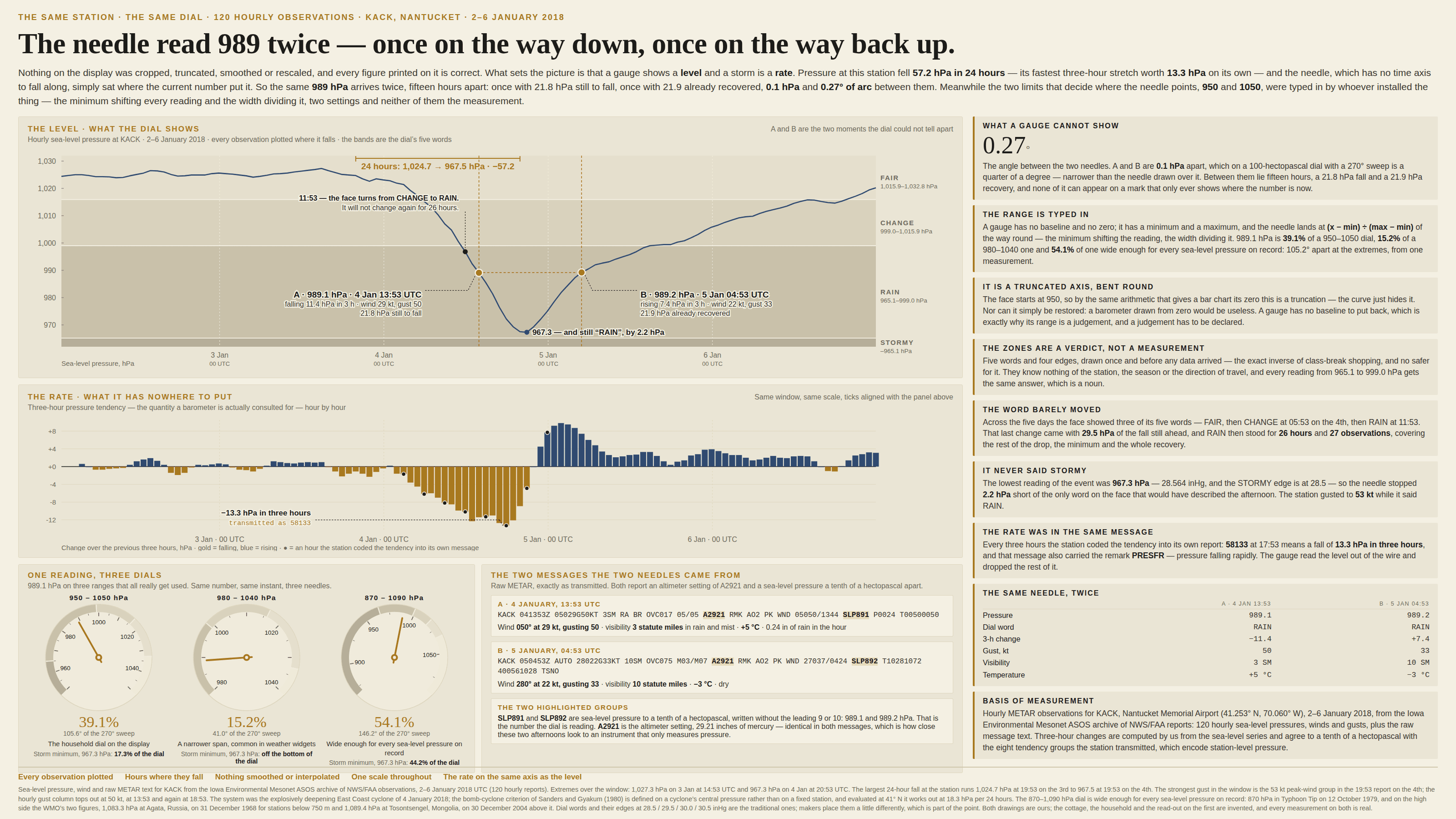
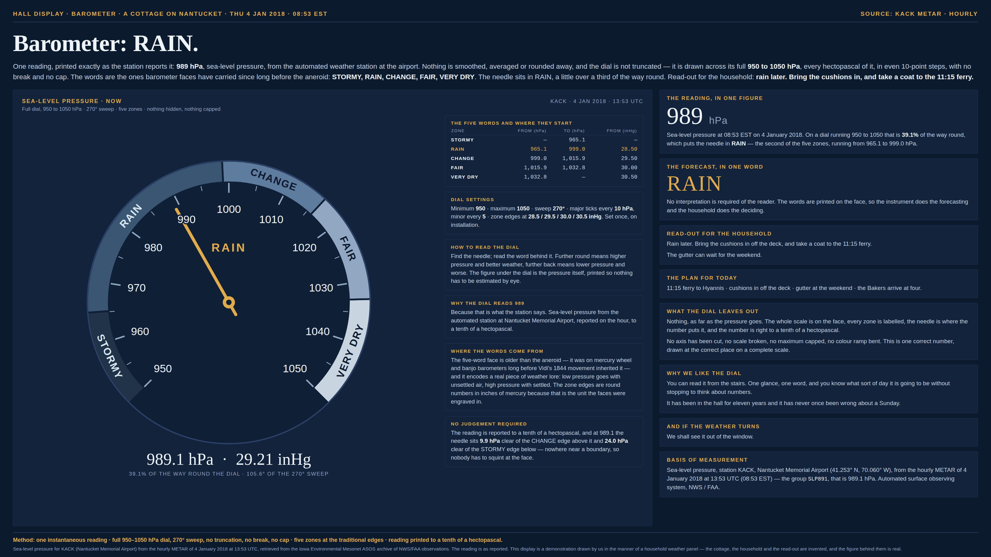
A gauge turns one number into an angle, and the angle is set by three things, only one of which is the number. There is no baseline and usually no zero: the needle lands at the value minus the minimum, over the maximum minus the minimum — the minimum shifting every reading and the width dividing it, two settings and neither of them the measurement, both typed in once by whoever installed the thing. Move either and the same measurement moves round the face. On top of that sit the coloured zones, which do something a chart normally leaves to the reader: they convert a continuous quantity into a verdict, at edges drawn long before the data arrived and identical in every context the gauge is ever hung in. And beneath both is the thing a gauge cannot do at all. It has one mark and no time axis, so it can only show a level — where the number is now. Any quantity whose meaning lives in its rate of change is invisible on one, and two moments that mean opposite things arrive as the same picture. That last failure is shared with every single-value display, a big number on a tile included; what a gauge adds is the other two, because it is the snapshot with a scale drawn round it and a verdict printed on the scale.
How to spot it
- Find the minimum and the maximum, then ask who chose them. They are not measurements; they are settings, and together they decide how far round the needle goes.
- Redraw it in your head with the range halved or doubled. If the reading moves from “nearly full” to “barely started”, the drama was in the limits.
- Ask what value sits at the start of the scale. A gauge whose minimum is not zero is a truncated axis bent into a circle, with the truncation hidden by the curve — and unlike a bar chart it often has no baseline to restore, which makes declaring the range the whole of the fix.
- Look for the coloured bands and ask where the edges came from — and note that they were drawn before the data arrived, which is the exact inverse of shopping for class breaks afterwards and no safer. An edge round in one unit and ragged in another (28.5 inches of mercury, 965.1 hectopascals) is a threshold inherited from an instrument rather than derived from anything, and a reading just inside one is reported exactly like a reading at the far end of it.
- Ask what happens off the ends. A value past the maximum is drawn pinned at the maximum, which is the clipped axis arriving in a second body.
- Look for the missing axis: time. There is one mark, so there is no yesterday on it, no rate, and no direction of travel. Ask whether the quantity is one people actually judge by its change.
- Two gauges that look identical are the tell. Real measurements taken hours apart rarely tie, and a dial that cannot separate a crisis from its aftermath is answering a narrower question than the reader is asking.
- The places they hide: dashboard tiles and BI “KPI” widgets, car and cockpit instruments, smart-home panels, capacity and utilisation meters, health-score rings, and the household barometer, which is the ancestor of all of them.
The fix
Give the number back its history. A single value almost never means anything on its own, so the default replacement for a gauge is a small line or a sparkline of the last however-many periods with the current reading printed beside it — same tile, same space, and now the reader can see the level, the direction and the rate at once. Where the rate is the finding, plot the rate: a change-over-the-last-interval chart answers the question the dial was being consulted for, and it is usually a number the system already has, since the sensor that reported the level generally reported the tendency in the same breath. Where a gauge really is right — a live instrument, glanced at, read for a threshold rather than an amount — treat its two limits as an axis and label them accordingly: put the range in the caption the way you print a unit, hold it fixed across every gauge on the page, run the minimum to zero wherever the quantity has one, and never let a value past the maximum be drawn pinned to it. Keep the zones for decisions that genuinely are categorical, say what each edge is and who set it, and print the number as well as the word, since a reading one unit inside a boundary and a reading at the far end of it are the same colour and not the same news. And for comparing several quantities, drop the form entirely. A row of gauges is a row of separate, unrelated scales, each with its own limits — which is the free-scale small multiple in circular dress. One sorted, zero-based bar chart puts them all on the same ruler and takes less room than the dials it replaces.
In the gallery