All techniques
Size & scale
The false common scale
Same word on the axis. Not the same thing being counted.
a.k.a. apples and oranges · incomparable units · the shared axis that isn’t · unit drift · mixed denominations
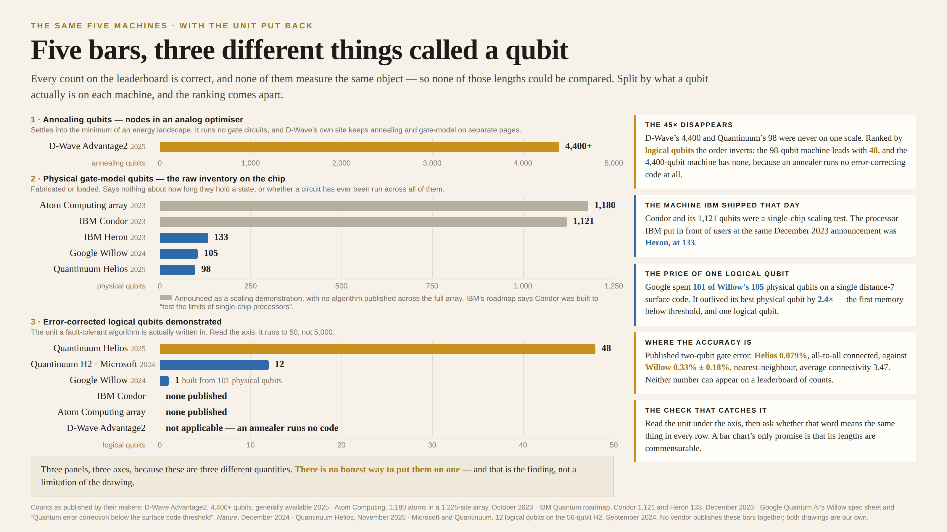
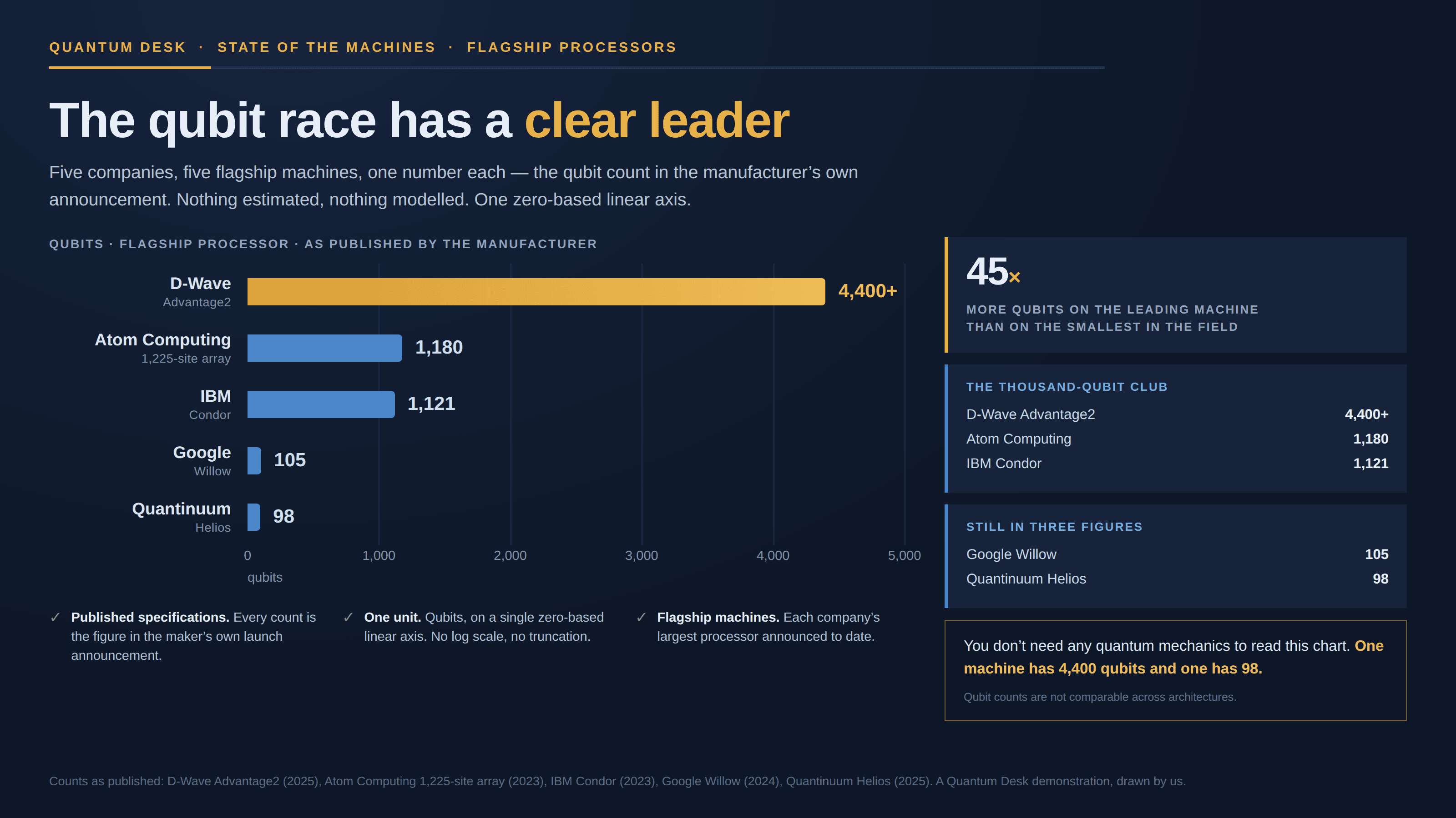
A bar chart makes exactly one promise: that its lengths are commensurable, because every one of them is so many of the same thing. Put rows on it whose unit quietly changes — counts of objects that do different jobs, figures collected under different rules, quantities that happen to share a word — and the promise is void while the picture looks unchanged. Nothing is exaggerated and no axis is bent; the ranking is simply about a quantity that does not exist.
How to spot it
- Read the unit under the axis, then ask whether that word means the same thing in every row.
- A word that a whole industry uses for several different objects — “users”, “cases”, “tons”, “qubits”.
- Rows sourced from separate publishers or spec sheets, with no line saying how the definitions were reconciled.
- One row an order of magnitude clear of the rest. A leader that far out is often a leader in a different unit.
- Ask what a single unit of this actually does. If the answer differs by row, the lengths cannot be compared.
The fix
Split the chart along the thing that changed. One panel per unit, each with its own axis, is not a failure to combine them — it is the finding, stated plainly. Within a panel the lengths mean something again, and the panels sitting one above another show the reader exactly where the comparison stops. If one number really is wanted across the rows, convert them into a common unit and show the conversion; if no conversion exists, say so, because “these cannot be added up” is usually the most useful sentence on the page. And where the interesting quantity is quality rather than count — accuracy, duration, yield — put that on its own axis too, since no amount of counting will produce it.
In the gallery