All techniques
Cherry-picking
The self-selected sample
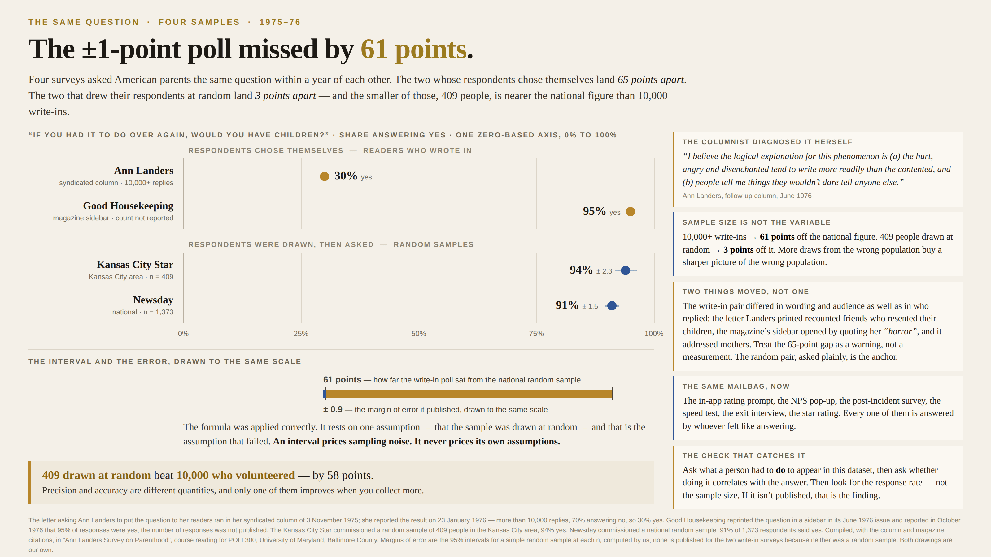
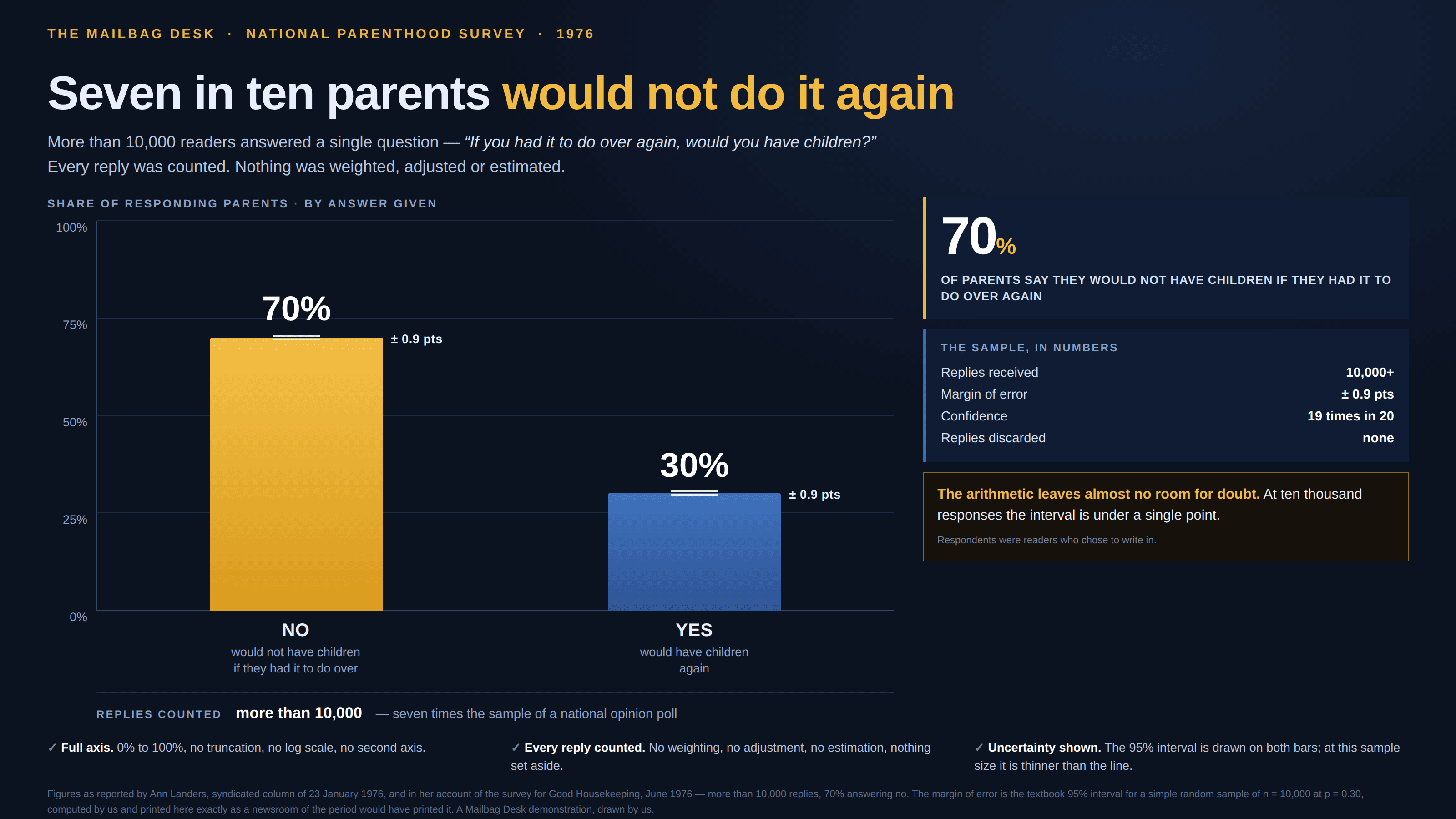
Ten thousand replies, every one of them from somebody who felt like replying.
a.k.a. voluntary response bias · self-selection bias · the opt-in poll · the write-in survey · convenience sample · nonresponse bias · the feedback form
Some samples are drawn and some samples walk in. When the respondents chose themselves — wrote in, clicked through, left a review, answered the pop-up — what you have is not a slice of the population but a slice of the people moved to reply, and what moves a person to reply is usually the very thing being measured. That makes the bias directional and unbounded, and it means more data cannot fix it: ten thousand volunteers is ten thousand draws from the wrong population. It is the near neighbour of survivorship bias without being the same thing — survivorship is about the cases that dropped out before you looked, self-selection about the ones that stepped forward.
How to spot it
- Ask what a person had to do to appear in this dataset, then ask whether doing it correlates with the answer.
- A big n offered as the credential. Sample size buys precision, which is a different thing from being right.
- “Respondents”, “readers who wrote in”, “users who rated”, “those who completed the survey” — every one of those is a volunteer.
- The response rate is missing. Not the sample size: the response rate — what share of the people approached actually answered.
- A margin of error printed next to a figure nobody sampled at random. The formula assumes the draw; it cannot check that one happened.
- A result far more positive or negative than any random sample of the same population. Feedback arrives from the delighted and the furious, rarely from the fine.
The fix
Draw the sample instead of letting it assemble itself: pick who to ask, then chase the ones who do not answer, because the non-responders are the sample. Where that is impossible — and for most product feedback it is — label the chart with the population it actually describes (“of the 3% who rated the app”), publish the response rate beside every figure, and never put an opt-in number on the same axis as a drawn one without saying which is which. Anchor it when you can: run a small random survey alongside the big self-selected one and report both, since a few hundred people drawn at random will beat ten thousand volunteers, and the gap between the two is the most useful number you will get all year. And treat the direction as knowable even when the size is not — ask who was moved to reply and you can usually say which way the figure leans before you have seen it.
In the gallery