All techniques
Size & scale
The bar with no true zero
The axis starts at zero. The quantity doesn’t.
a.k.a. the offset origin · interval scale · the arbitrary zero · ratios floored at 1 · degrees in a bar chart · index points as bars · the unreachable baseline · levels of measurement · the constant inside every bar
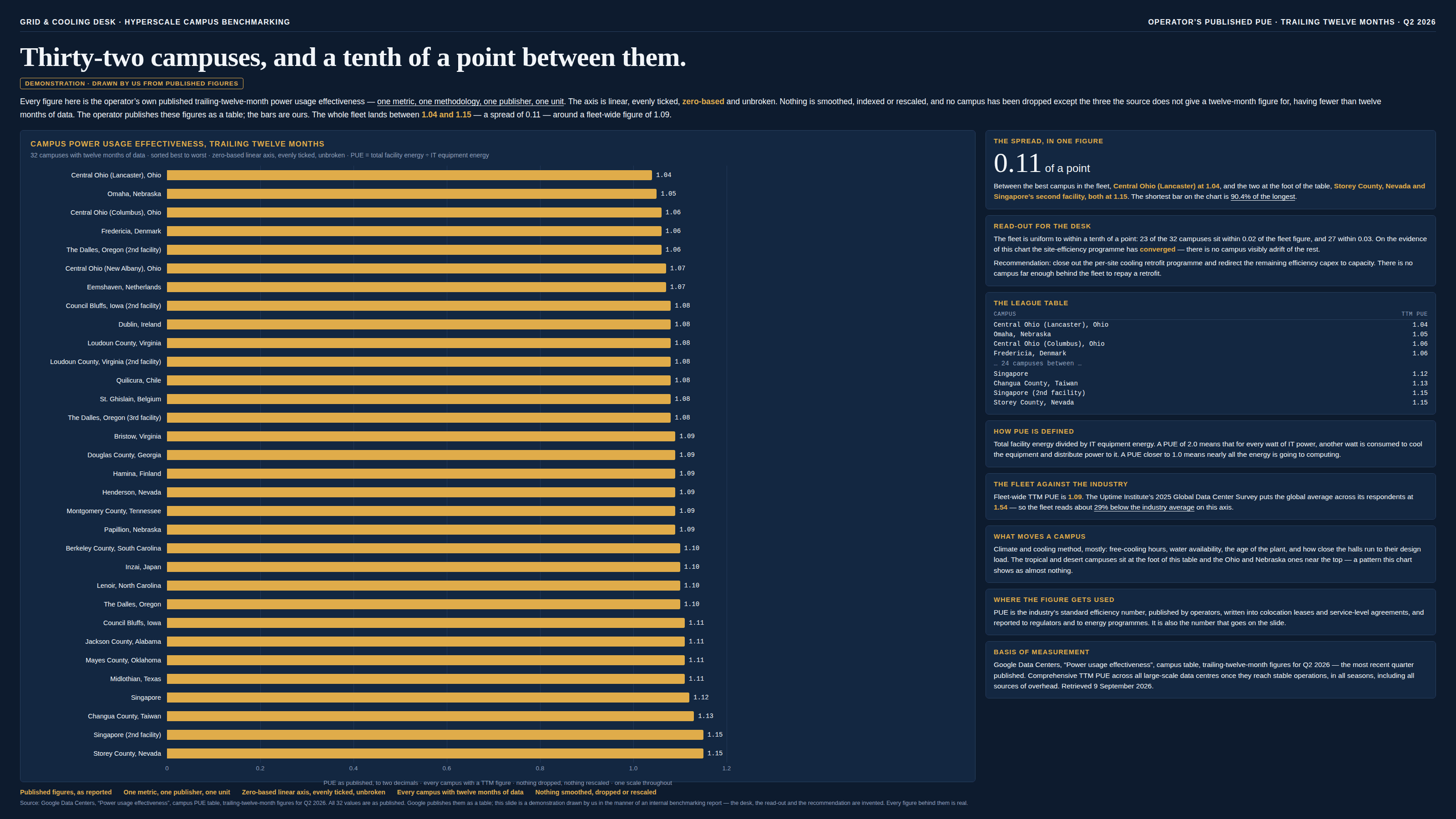
Every other baseline crime in this taxonomy is about the axis. This one is about the unit, and it survives the audit that catches the others: the axis genuinely starts at zero, the ticks are even, nothing is broken or clipped, and each bar is exactly proportional to the number beside it. The number is the problem. A bar says “this much of the thing”, which only works if the thing runs out at zero — and plenty of everyday measures do not. A ratio of a total to one of its parts cannot go below 1. An index is 100 at its base by construction. Degrees Celsius put their origin at the freezing point of one substance, and IQ has no origin at all. Draw any of them from zero and the distance between the axis and the quantity’s real origin is added, identically, to every bar — a constant the data can never move, drawn to scale, usually taking up most of the ink. Which way it lies then decides which way the chart is wrong, and it goes both ways. Where the drawn zero sits below the true origin, the constant pads every bar and every ratio is squeezed toward 1: a fleet whose worst site wastes nearly four times what its best one does arrives as a row of bars a tenth apart. Where the drawn zero sits above it, the padding is negative and ratios blow up instead, which is how 20 °C becomes “twice as warm” as 10 °C when in absolute terms the two differ by 3.5%. Either way the length has stopped being the quantity, and the giveaway is that the subtraction needed to fix it is often printed on the page already, down in a footnote, because whoever quoted the comparison in words could not get a sensible number out of the axis either. Two neighbours are worth telling it apart from. “The logarithmic unit” is the same shape of crime — the distortion lives in the measurement rather than in the frame — but there the unit is a logarithm, so distances are ratios and no amount of subtracting will fix it; pH and the decibel belong to both pages, with the offset the smaller of their two problems. “The rebased index” owns the question of which base year to pick; this page owns what happens when an index is then drawn as a bar, since every one of them carries a 100 that no series can move.
How to spot it
- Ask what a zero on this axis would be. If it is unreachable, undefined, or a convention somebody agreed on — a floor of 1, an index base, a freezing point, a datum, a test that was normed to 100 — the bar is measuring from a place the data cannot go.
- Look for a floor. Anything defined as a total divided by one of its own components starts at 1, and that 1 is inside every bar on the chart: PUE against IT load, fully-loaded cost as a multiple of base salary, total cost of ownership as a multiple of purchase price, gross-up factors of every kind. Careful here — plenty of ratios that look similar are floored at 0 instead, like a load factor or an occupancy rate, and those are ordinary zero-based quantities that bars suit fine.
- Compare the shortest bar with the tallest. If the short one is 90% of the tall one, then nine tenths of every bar is a constant and the whole finding is living in the last tenth.
- Read the ratio out loud. “Nevada is 1.1 times Ohio” for a pair whose overheads differ by nearly four times, or “Tuesday was twice as warm as Monday” — a ratio that sounds wrong in either direction usually is, and the origin is why.
- Watch for the fix in the footnote. Where a source subtracts something from both numbers before quoting a comparison — “83% less overhead” off a 1.09-against-1.54 pair — that subtraction is the axis the chart should have used, and a source that prints it is doing the right thing where its own chart did not.
- Units with famous offsets: °C and °F, calendar years and clock times, elevations above a datum, pH and other logged units (which have this problem and a second one), index points, IQ and standard scores, model numbers and any other label that merely looks numeric.
- A “percentage improvement” computed off the reading rather than off the quantity. Cutting PUE from 1.20 to 1.10 is not an 8% saving in anything; it is half the overhead gone.
The fix
Plot the quantity, not the reading. Subtract the origin, put the difference on a zero-based axis, and name it in the unit people actually act on: overhead energy per unit of IT power rather than PUE, degrees above freezing rather than degrees Celsius, the excess above the index base rather than the index. The picture that comes back is usually unrecognisable, and that is not the redraw introducing drama — it is the redraw removing a constant that was standing in front of the data. It also restores the arithmetic the first chart quietly broke: on the subtracted scale a ratio between two bars is a ratio between two quantities again, so “nearly four times” can be said out loud instead of being carried in a footnote. Where nothing can be subtracted because the unit has no origin at all — an IQ, a standard score, a longitude — the answer is not a better baseline but a different mark: a dot plot encodes position, and position is the whole of what an interval scale can honestly carry, which is why differences on such a scale are worth reading and ratios never are. Keep the familiar reading where people genuinely use it, because usually they do — a PUE is what a lease is written against and a thermostat is set in degrees — but print it as a label beside the honest bar rather than as the bar, and say in the caption what the unit’s zero means. And never let the offset reading through a ratio, a percentage change or a “times better” on the way to a slide: differences survive an offset, and nothing else does.
In the gallery
![The same 32 campuses on a cream background, kicked “The same 32 campuses · the same published figures · one subtraction” and “Overhead energy per unit of IT power · PUE − 1 · Q2 2026”, headlined “A tenth of a point apart, and 3.75 times apart.” A standfirst says nothing on the benchmarking slide was truncated, smoothed or rescaled, its axis really does start at zero and all 32 figures are correct; that what sets the picture is that a PUE cannot go below 1.00, being total facility energy divided by IT energy, so the 1 is the computing load itself and only what sits above it is overhead; that the 1 is inside every bar, identical in all of them, taking up between 87% and 96% of the ink on a scale the data can never touch; that subtracting it turns the same 32 numbers into watts of cooling and power distribution per watt delivered to computing, running from 0.04 to 0.15; and that the operator’s own page does exactly this and says so, a numbered footnote printing the whole subtraction the moment it wants to state a comparison in words. The main panel, headed “The same 32 campuses, drawn as overhead” and subtitled “Overhead energy per unit of IT power (PUE − 1) · same campuses, same order, same published figures, with each campus’s PUE kept as a label · zero-based linear axis, evenly ticked, unbroken”, uses the same bar track as the benchmarking slide but an axis running from 0 to 0.16 in even steps of 0.04. The block of near-identical bars has become a fan: Central Ohio (Lancaster), Ohio at the top is a short blue bar labelled “0.04 PUE 1.04”, Omaha is 0.05, the middle of the fleet sits at 0.08 to 0.11, and Singapore (2nd facility) and Storey County, Nevada are orange-red bars at 0.15, nearly four times the length of the blue one; every bar carries its overhead figure and its PUE reading side by side. A caption reads “Same numbers, same sort, one subtraction · the axis now starts where the quantity starts”. Seven cards run down the right. “What the subtraction does” tabulates three pairs as the bars showed them and as the data centres are doing them: Storey County against Central Ohio (Lancaster), +10.6% and 3.75×; Singapore against Omaha, +6.7% and 2.40×; Changua County against Fredericia, +6.6% and 2.17×. “The publisher’s own footnote” quotes it verbatim — “(1 − (Google’s overhead energy use [0.09] divided by the industry average overhead energy use [0.54])) × 100 = 83%” — notes that a fleet-wide 1.09 against an industry average of 1.54 is 29.2% below it on the axis the chart uses, that nobody quotes that because the sentence people want is “83% less overhead” and it needs the 1 taken off both numbers first, and adds that this is the practice the exhibit is recommending, printed by the operator in full with the arithmetic shown — the chart being the thing that lost it. “Two decimals is not many” says subtracting a constant leaves the difference untouched and wrecks the precision of the ratio: a PUE published as 1.04 is anything from 1.035 to 1.045, so an overhead of 0.04 carries one significant figure and the 3.75× could honestly be anything from 3.2× to 4.4×, with the same bound applying to every ratio on the page — the 2.40× spanning 2.09–2.78 and the 2.17× spanning 1.92–2.45 — which is a reason to publish three decimals rather than to go back to the first chart, where the same uncertainty is present, unchanged, and simply cannot be seen. “Other units with an offset origin” tabulates power usage effectiveness against a real zero of 1.00, degrees Celsius against −273.15 °C, degrees Fahrenheit against −459.67 °F, an index at 2017 = 100 against 100, IQ and standard scores against no zero at all, elevation against its datum and a calendar year against an epoch, with what a bar on each should show. “One bar, taken apart” draws a single campus at PUE 1.09 from zero as a composite bar: a long pale segment keyed “1.00 — the IT load. Identical in every bar on the chart, and no data centre can move it” and a short gold segment keyed “0.09 — the overhead. The only part of the bar that is data”, over the line “The first chart drew both. The second draws the right-hand piece.” “What to draw instead” says to plot overhead per watt of IT on a zero-based axis with the familiar PUE printed beside each bar as a label, to keep PUE where people act on it since a colocation lease is written against a PUE, and never to send the reading through a ratio or a percentage change, because differences survive an offset origin and nothing else does. A “Basis of measurement” card credits Google Data Centers, “Power usage effectiveness”, campus table, TTM figures for Q2 2026, and the same page’s fleet figure and footnote citing the Uptime Institute 2025 Global Data Center Survey global average of 1.54, retrieved 9 September 2026, with the subtraction, the ratios and the rounding bounds being ours. Five notes run along the foot: the same 32 published figures; one subtraction, named; zero-based on the quantity’s own zero; the reading kept as a label; the rounding stated. A closing footnote credits the source, notes that the 83% comparison uses the 2025 annual fleet figure which is also 1.09, and states that Google publishes these figures as a table, that both drawings are ours, that the desk, the read-out and the recommendation on the first are invented, and that every figure behind them is real.](/_next/image?url=%2Fcharts%2Fpue-league-table%2Fhonest.png&w=3840&q=75&dpl=dpl_EcoyHKtfh6kHhfsoviziEJYWJ57N)