All techniques
Size & scale
The map projection
Greenland is not bigger than Africa. The map is.
a.k.a. Web Mercator · EPSG:3857 · pseudo-Mercator · the basemap · conformal projection · area distortion · the flat map
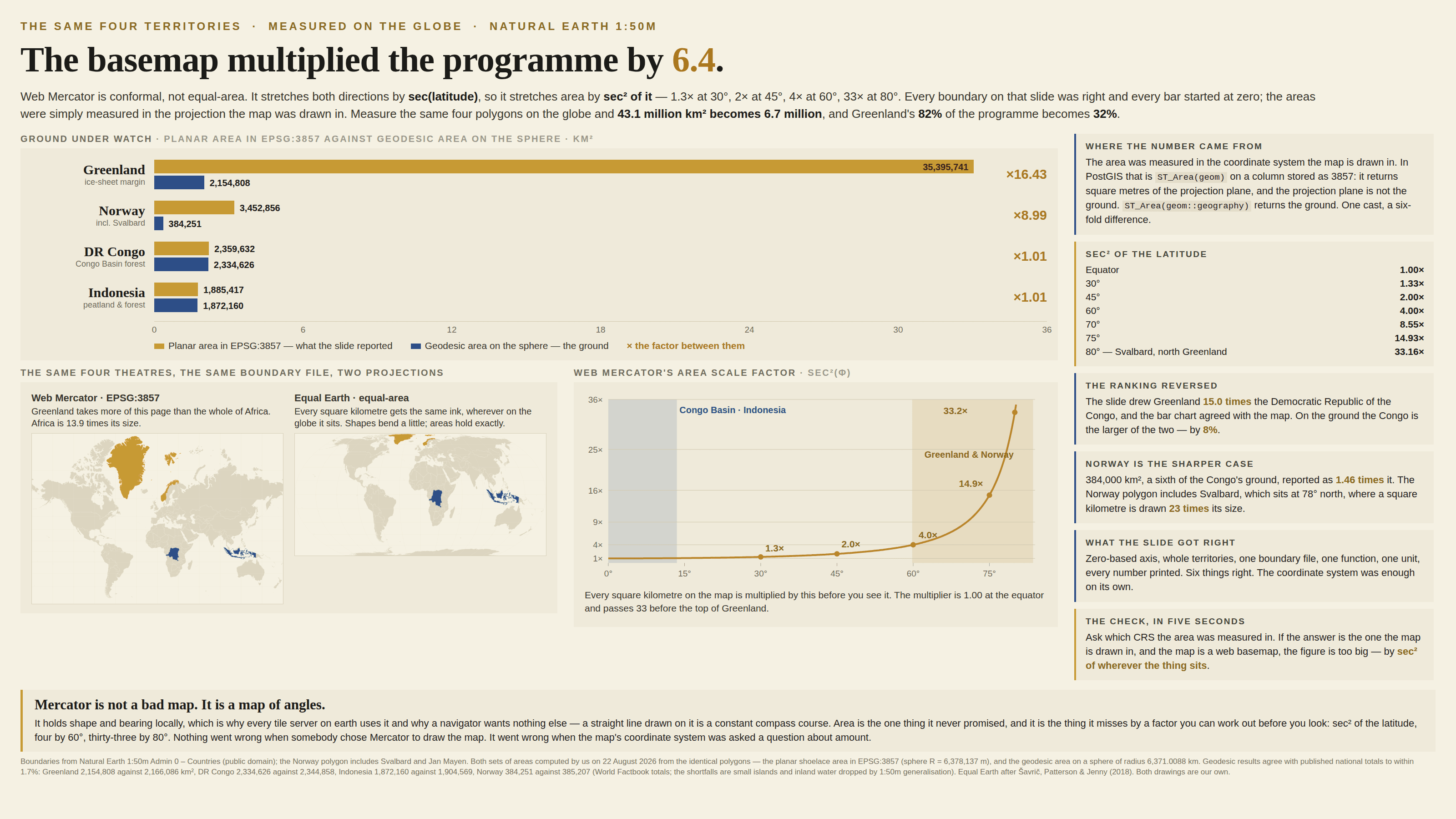
A globe cannot be flattened without something being stretched, and every projection chooses what it will sacrifice. Web Mercator — the one under nearly every map on the internet — keeps angles and local shape, and pays for it in area: it stretches both directions by the secant of the latitude, so it stretches area by the square of that. Every square kilometre is quietly multiplied before you see it, by 1 at the equator, 2 at 45°, 4 at 60° and 33 at 80°, and the eye reads the ink rather than the coordinates. The same arithmetic escapes the picture and turns up as a figure with units on it, because a GIS asked for an area in the coordinate system it happens to be drawing in will answer in square metres of the projection plane and never mention that the plane is not the ground.
How to spot it
- Ask which projection. On the web the answer is almost always Web Mercator — EPSG:3857 — and it is not equal-area.
- Look at the top of the world: Greenland the size of Africa, Russia half the page, Antarctica a wall along the bottom.
- The multiplier is sec² of the latitude — 1.3× at 30°, 2× at 45°, 4× at 60°, 15× at 75°, 33× at 80°. Two shapes at different latitudes are drawn at two different scales.
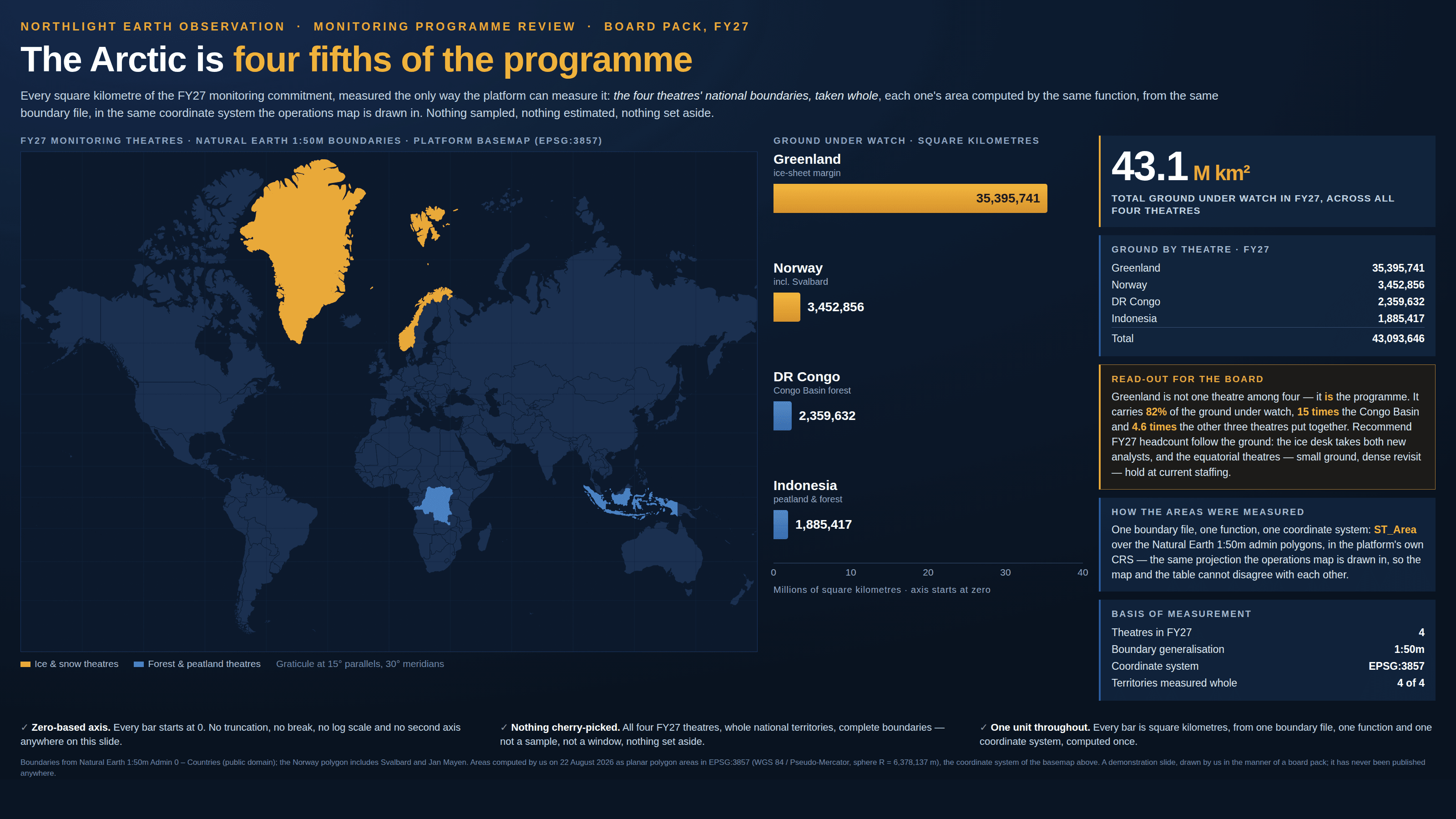
- For any area figure that came out of a GIS, ask which coordinate system it was measured in. Measuring in the display projection is the commonest way a wrong square-kilometre number reaches a slide.
- Dots, bins and choropleth shading on Mercator give northern ground more ink per unit of whatever is being counted, before any colour scale is chosen.
- An equal-area map gives itself away by looking slightly wrong — Africa enormous, Greenland modest, the continents squashed a little toward the poles. That is what correct looks like.
The fix
Pick the projection for the question. If the question is about amount — area, density, share of the ground — use an equal-area projection and name it: Equal Earth or Mollweide for the world, an Albers or Lambert equal-area conic for one country. If the question is about position or bearing, Mercator is the right answer and always was; a straight line on it is a constant compass course, which is the whole reason it exists. Measure areas on the ellipsoid rather than in whatever plane the map is drawn in — in PostGIS that is the difference between ST_Area on a 3857 column and ST_Area on the same geometry cast to geography, which is to say the difference between a number and that number times sec² of the latitude. Put the projection in the caption the way you would put units on an axis, because a map without one is a chart whose scale is a secret. And where the comparison actually matters, take it off the map altogether: two shapes at different latitudes will never be comparable by eye, and a sorted bar chart of the areas settles in a glance what a world map cannot settle at all.
In the gallery