All techniques
Cherry-picking
The size-biased count
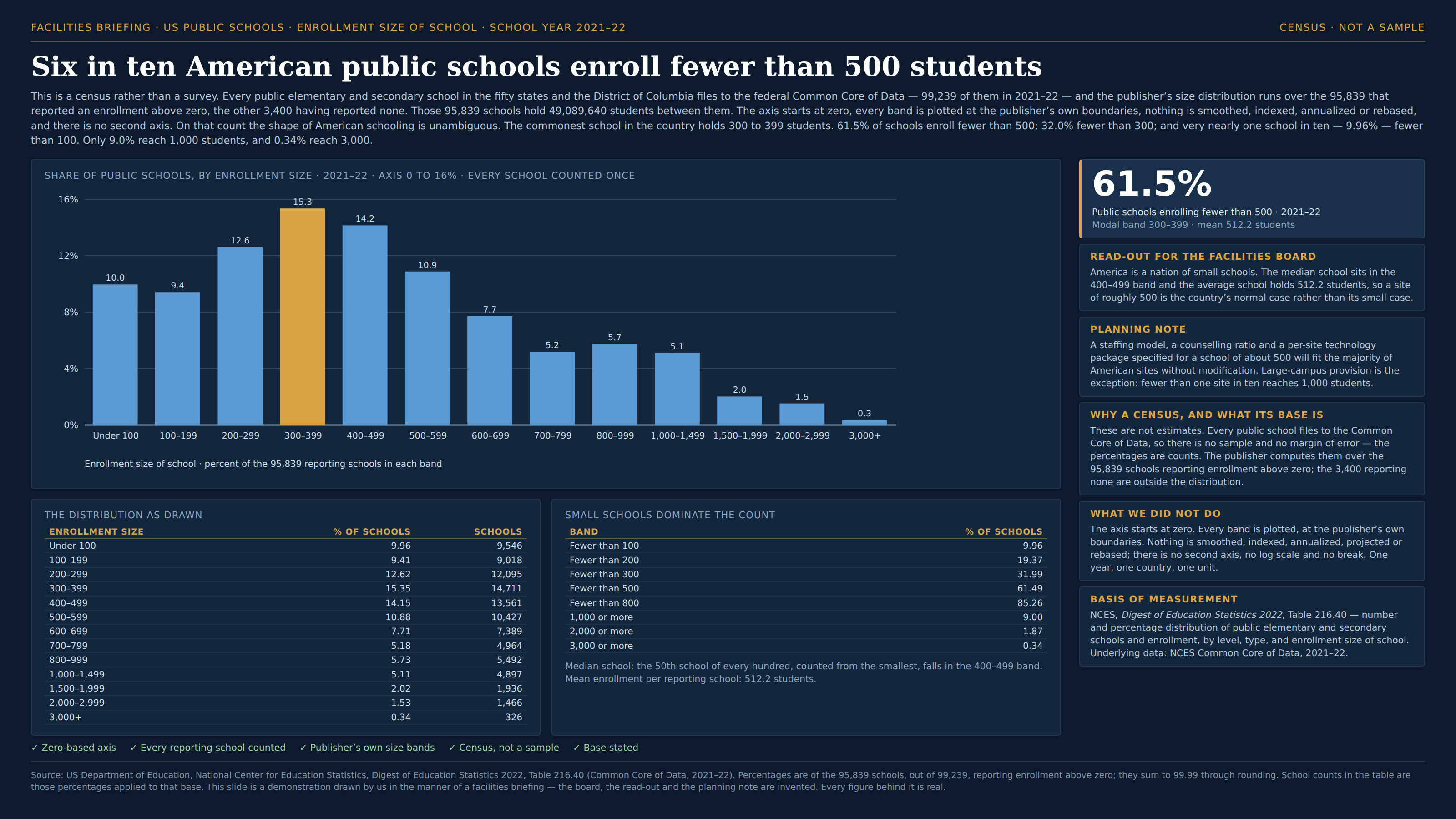
A school of forty counts once. So does a school of four thousand.
a.k.a. the inspection paradox · length-biased sampling · size-biased sampling · the class-size paradox · the waiting-time paradox · the friendship paradox · unit of analysis · counting schools instead of students · sampling containers, not contents
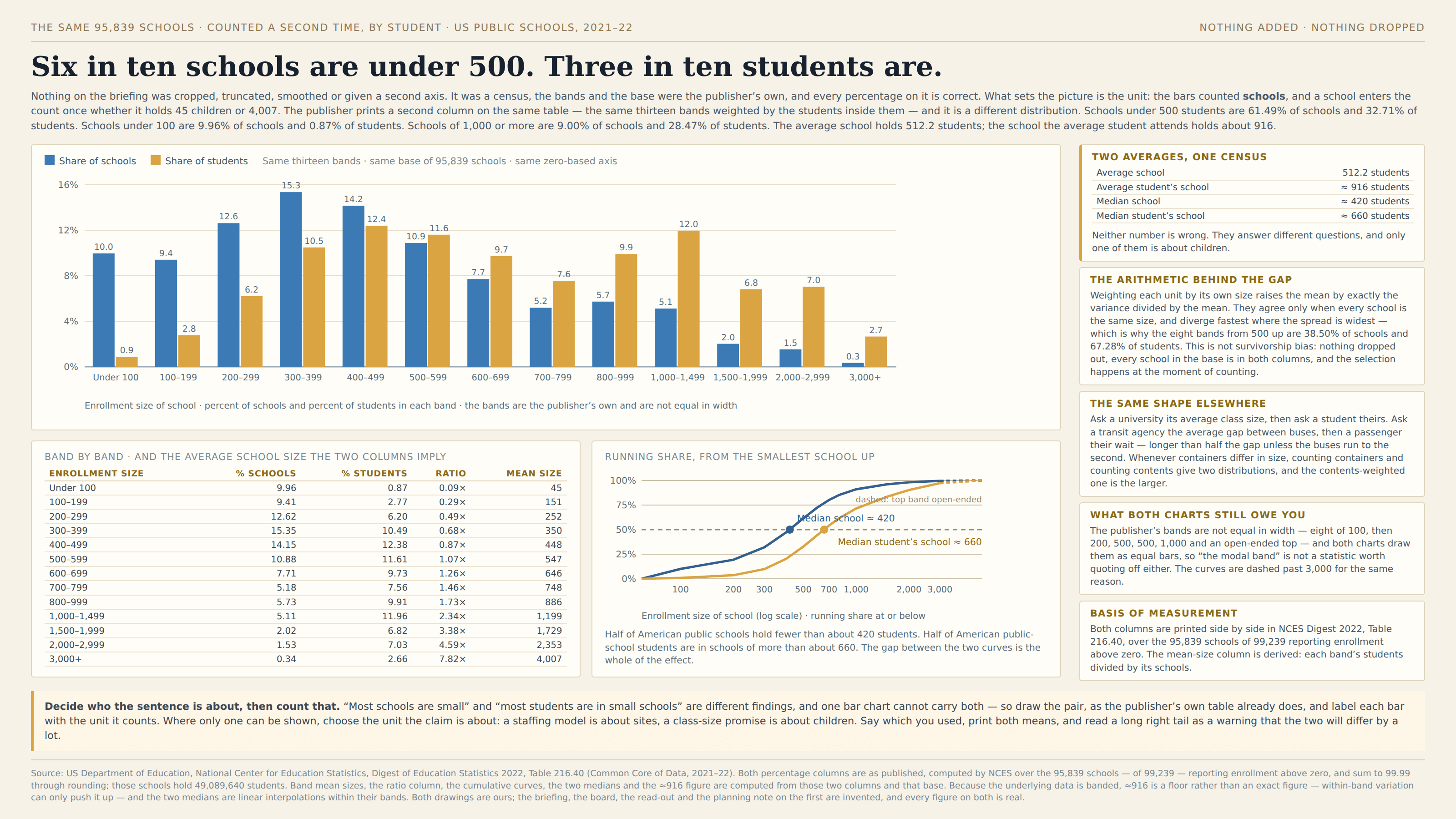
Every count needs a unit, and a chart of containers gives each container one tally however much it holds. That is the right answer to some questions and the wrong answer to most of the questions people actually ask, because the reader is usually not a school, a class, a bus or a firm — the reader is inside one. Count the contents instead and each container is weighted by its own size, which drags the whole distribution to the right: the big ones, few enough to look like a tail, hold a share of the contents wildly out of proportion to their number. The two averages that result are not rivals and neither is wrong; they differ by exactly the variance divided by the mean, so they agree only when every unit is the same size and diverge fastest where the spread is widest. Nothing is excluded, no axis is bent and the arithmetic is right. The unit is simply not the one the sentence was about.
How to spot it
- Ask what one tally is. A school, a class, a bus, a firm, a household, a hospital — then ask whether the claim is about those or about the people inside them.
- A claim about typical experience made from a count of containers. “Most classes are small” and “most students are in small classes” are different sentences, and one chart cannot say both.
- A long right tail of very large units. The tail is a sliver of the count and a slab of the population, and it is exactly the part a count of containers draws as negligible.
- Two averages that ought to agree and don’t: the average class against the average student’s class, the average firm against the average employee’s firm. The gap is the spread, and it is often a factor of two.
- Waiting time. If buses come every ten minutes on average, the average wait is more than five unless they run to the second, because a long gap is a bigger target to land in — which is the same arithmetic wearing a clock.
- Surveys of institutions. One questionnaire per school, per practice, per company means the smallest respondent and the largest carry equal weight in every percentage the report prints.
- Averages of averages. Averaging each store’s mean basket, each ward’s mean stay, each class’s mean score gives every unit one vote and is not the average customer, patient or pupil.
- The friendship paradox and its relatives, where the sampling happens through the connections rather than the nodes: your friends have more friends than you do, on average, because a popular person appears on more lists.
The fix
Decide who the sentence is about, then count that. If the claim is about children, weight the bands by children; if it is about sites, weight them by sites — and say in the caption which unit the bars are, the way you would print a unit on an axis. Best of all is to draw both, because the pair is more informative than either and costs one extra series: the gap between the two distributions is itself the finding, and a reader who sees it will never mistake one for the other again. Print both means beside them, since the container mean and the contents-weighted mean are a matched pair and the distance between them is the spread in plain sight. Where only one can be shown, choose the unit the decision runs on: a staffing model and a maintenance budget really are about sites, and a class-size promise really is about children, so the same dataset honestly supports two different charts for two different meetings. Treat a long right tail as a warning that the two answers will be far apart, and be especially careful with an average of averages, which quietly picks the container as its unit while looking like an average of everything. And keep it apart from its neighbours, because the remedies differ: survivorship bias is about cases that left the dataset and self-selection about cases that walked in, while here nothing is missing at all — every unit is present in both counts, and the selection happens at the moment of counting, in the choice of what one tally represents. The nearest miss is the missing denominator, and the difference is worth holding on to: that is a count that should have been a rate, whereas here both figures are already rates and the whole argument is over what they are rates of. It sits under cherry-picking for the same reason, since choosing the unit is choosing the population the chart describes — which is a selection, even though it deletes nobody.
In the gallery