All techniques
Size & scale
The radar chart
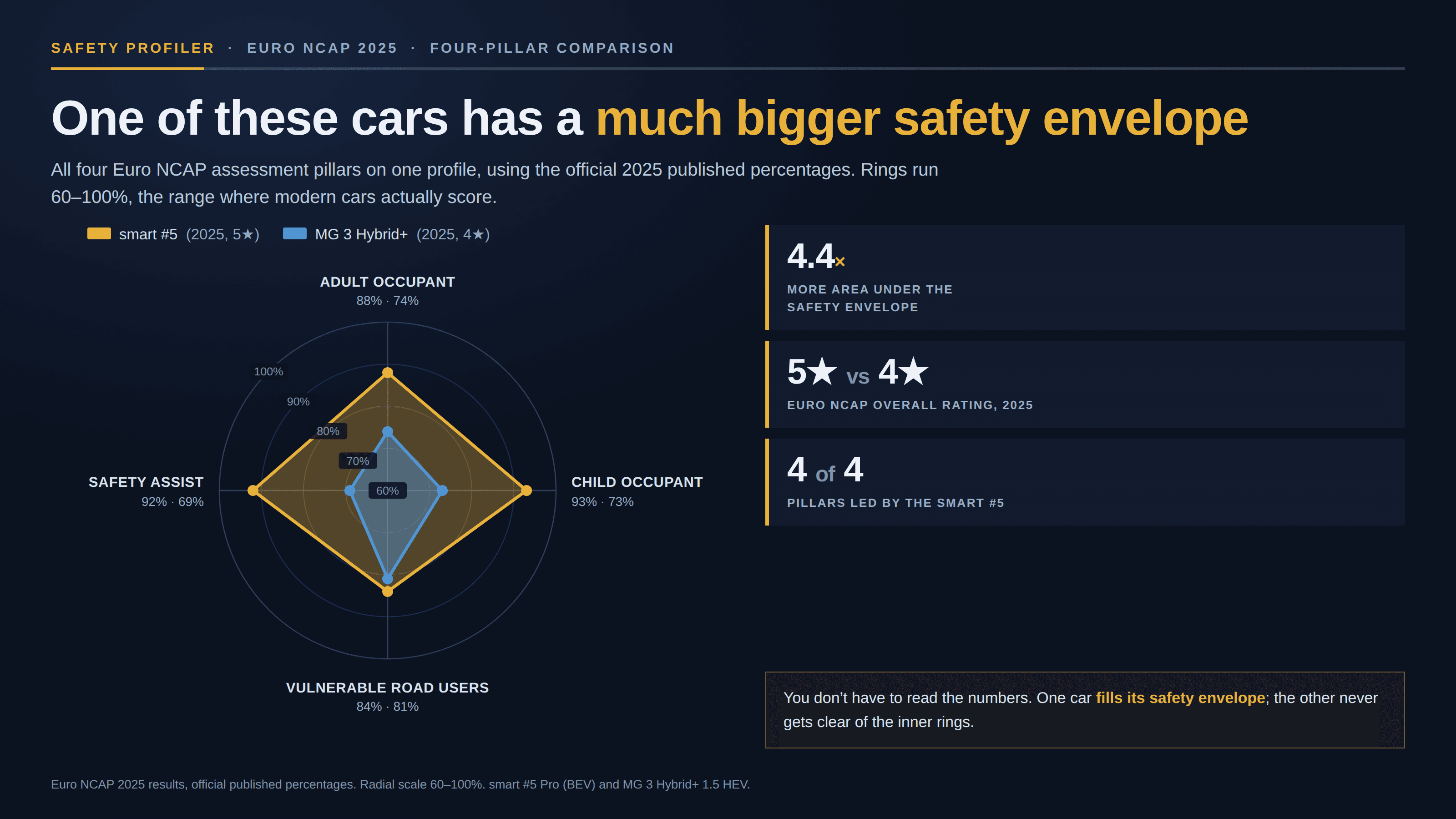
A spoke twice as long paints four times the ink.
a.k.a. spider chart · star plot · kiviat diagram · web chart
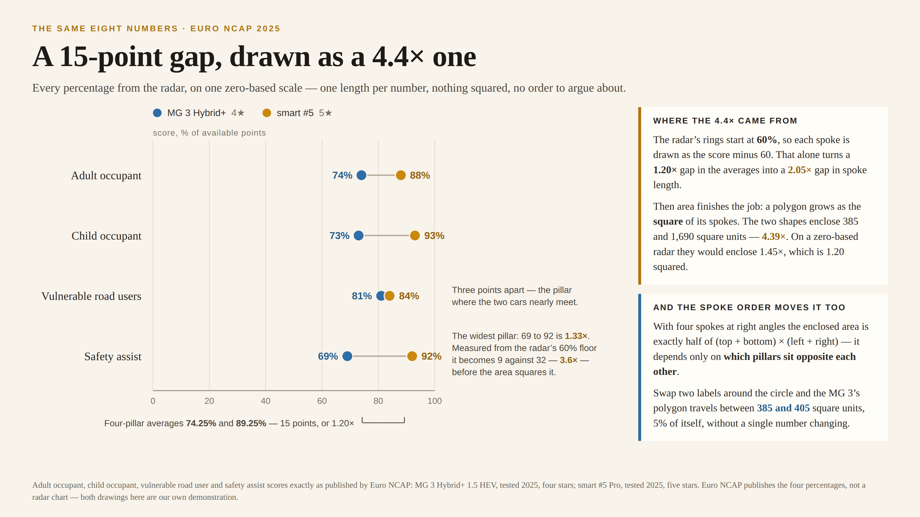
A radar chart asks you to judge a row of numbers by the area of the shape they enclose, and area grows as the square of every spoke — so a modest lead in the scores arrives on the page as a commanding blot. Two more knobs hide in the same picture: the radial axis is rarely zero-based, which stretches the spokes before the squaring even starts, and the enclosed area depends on which categories happen to sit opposite each other, so reordering the labels changes the shape without changing a number.
How to spot it
- Read the innermost ring. Is it 0, or is it 50?
- The shapes differ far more dramatically than the numbers printed next to them.
- Ask why the categories are in that order, then imagine two of them swapped.
- Categories in different units, silently normalised onto one 0–100 radius.
The fix
Put the categories on one shared, zero-based scale — a dot plot or a short row of bars. One length per number, nothing squared, no ordering to argue about. If the shape of a profile genuinely matters, small multiples of bars compare shapes without inventing an area.
In the gallery