All techniques
Axis crimes
The rebased index
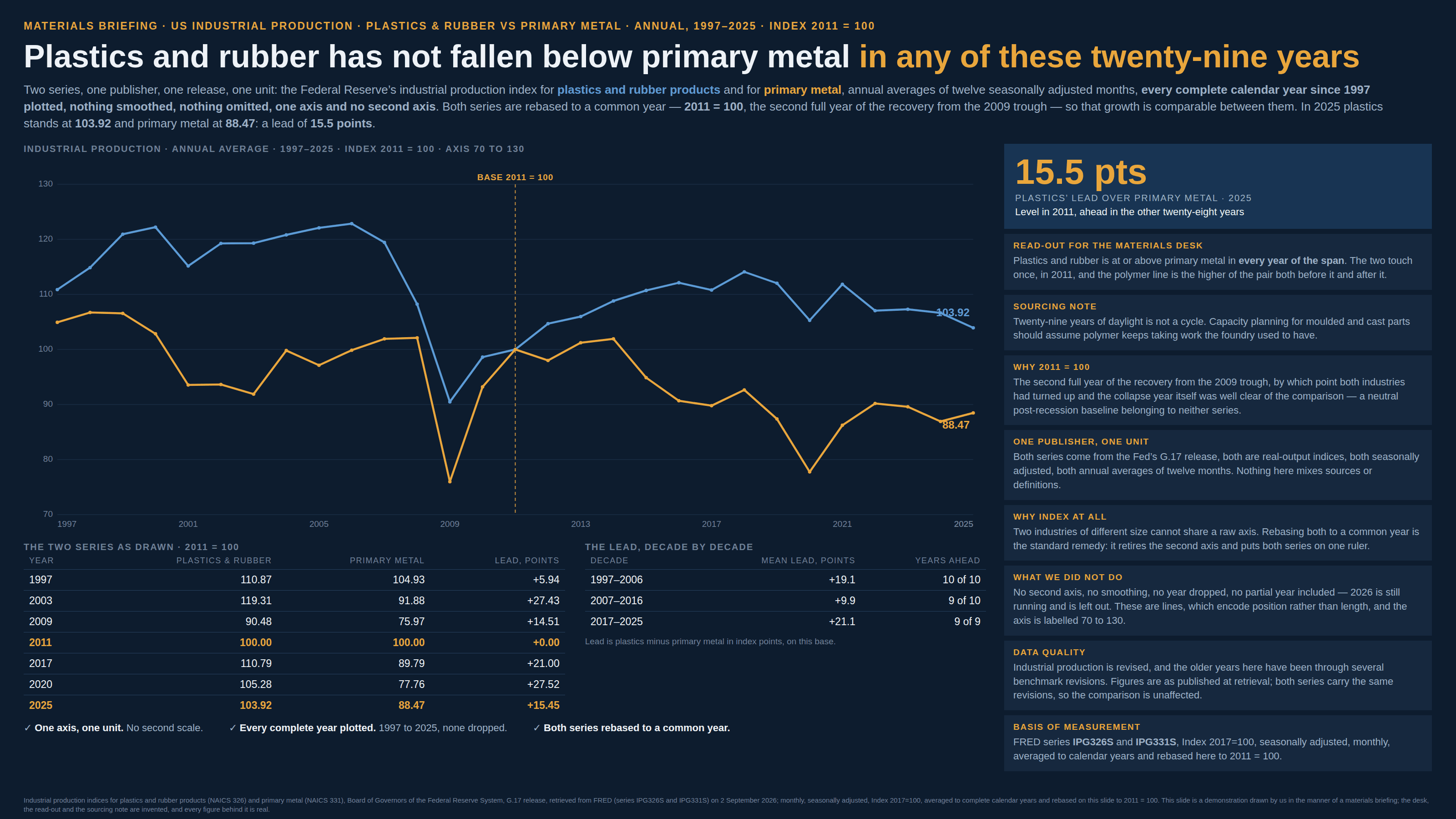
Every line passes through 100 on a date somebody chose.
a.k.a. rebasing · the base year · indexed to 100 · 2017 = 100 · the reference period · normalised series · the common baseline · index points
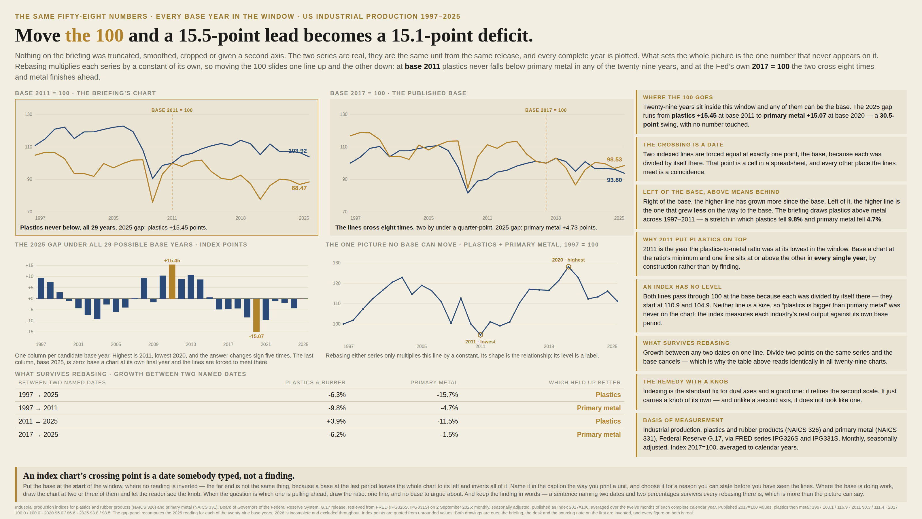
Indexing divides every series by its own value in one chosen period and multiplies by 100, which is why it is the standard cure for dual axes: two quantities of different size, in different units, end up on one honest ruler. The cure has a knob. Each series is divided by a different number, so moving the base multiplies each line by a constant of its own — one slides up, the other down — and the gap the reader carries away is a fact about the date in the divisor as much as about the data. The base is also the single point where the chart declares the series equal, so the crossing everybody reads off is a cell in a spreadsheet. And the reading inverts either side of it: to the right of the base the higher line has grown more since the base, while to the left the higher line is the one that grew less on the way to it.
How to spot it
- Find the 100. Every line goes through it on the same date, and that date is the only thing on the chart that is not a measurement.
- Ask where the base sits inside the window. A base in the middle means everything to its left is being read backwards, because there the higher line is the one that grew less.
- Ask why that year. A trough for one series, a peak for another, a round number, “the last normal year” — each is a choice, and each moves every gap on the chart.
- Redraw it in your head with the base moved to another year. If the ranking survives, it was in the data; if it flips, it was in the divisor.
- Two lines that never cross except at the base. Basing at the extreme of the ratio between them puts one above the other in every period by construction, and it looks exactly like a durable lead.
- A claim about size — bigger, larger, the leader — made from an index. An index has no level: every line passes through 100 at the base because it was divided by itself there, and nowhere on the chart is a quantity.
- A gap quoted in “points”. Index points are not a unit of anything; they are the difference between two growth factors measured from a date the caption may not even name.
- The base hiding in the axis title: “2017 = 100”, “Jan 2020 = 100”, “rebased”, “indexed”, “normalised”. Where no base is named at all it is usually the first period plotted, which quietly makes the choice of window a choice of base.
The fix
Choose the base for a reason you can state before you have seen the lines, then state it: put it in the caption the way you print a unit, and prefer the start of the window, because with the base at the first period every point is to its right and “above” means “grew more since the start” everywhere on the chart. The far edge is not the same thing, and is worth saying out loud because it looks equally tidy: a base at the last period puts the whole chart to its left, so every reading on it is inverted — the mid-window trap taken to completion. Where the base is doing work — a rebound measured from a trough, a comparison anchored on a year one series happened to have a bad one — draw the chart at two or three bases and let the reader see the knob; what barely moves between them is the finding. Better still, take the comparison off the index altogether. When the question is which one is pulling ahead, plot the ratio of the two series as a single line: rebasing either of them only multiplies that line by a constant, so its shape is the whole relationship and there is no base left to argue about. Keep the finding in words as well as in ink, because growth between two named dates is the one thing rebasing cannot touch — dividing two points on the same line cancels the base — so a sentence saying that one series rose 3.9% and the other fell 11.5% between two stated years survives every version of the picture, which is more than the picture can say for itself. And never let an index carry a claim about size. Every line passes through 100 at the base because it was divided by itself there, so there are no levels on the chart at all; if the reader needs to know which is bigger, that is a different chart with a real unit on its axis.
In the gallery