All techniques
Framing & context
The date the paperwork arrived
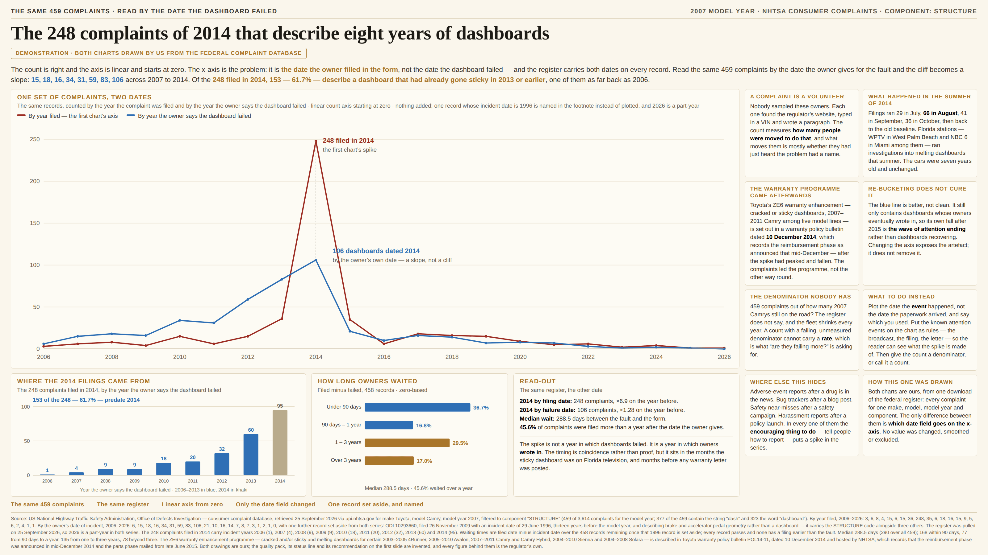
Two dates on every record, and the chart is drawn on the one about the form.
a.k.a. report date · received date · event date versus report date · date of record · notification date · entry date · onset versus report · the date the database sorts by · created_at
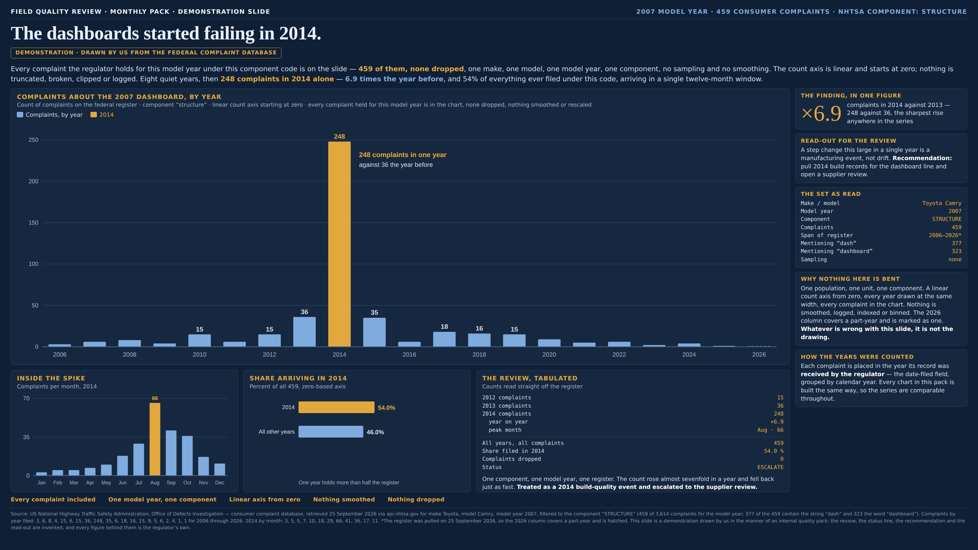
Anything assembled out of reports carries at least two dates: the day the thing happened and the day somebody wrote it down. Only the first is about the world. The second is about a form being filled in — and it is the one almost every system sorts, indexes and charts by, because it is the one the system can be certain of. The event date arrives from a human memory and is sometimes blank; the received date is stamped by the machine, is never missing, and is therefore the default. So the axis quietly stops being time and becomes administrative time, in which nothing happens until it is reported. Every change in how eagerly people report — a broadcast, a lawsuit, a letter from the manufacturer, a new online form, a staff member who chases things up, a hotline number read out on air — lands on the chart as a change in the phenomenon, drawn in the right unit, at the right height, in the right year. Two neighbours sit close enough to be worth holding apart, and the difference in each case is where the damage lands and whether waiting repairs it. The unfinished period also comes from reporting lag, but it bites only the final bin, because that is the one still filling up; wait a quarter and it heals itself. The immature cohort buckets events by the cohort they belong to rather than by a date at all, so its shortfall reaches back years along the whole right-hand end. This one puts the distortion anywhere in the series, usually somewhere in the middle, and it is permanent: a spike drawn on report dates will still be in exactly that year a decade from now, because the records really were filed then. Nothing is incomplete, nothing is provisional, and nothing is waiting to arrive.
How to spot it
- Count the date columns. A register of reports almost always has two or more — occurred and received, onset and notified, incident and filed, transaction and posting — and the chart will have been built on whichever one the query defaulted to.
- A spike with near-vertical sides in a series of human events. Things that happen in the world have onsets spread across the population; things that get reported have a news cycle, and a news cycle has an edge.
- Go inside the spike and plot it by month. A rise over three or four months with a single peak and a fall back to the old baseline is the shape of attention. A production line, an epidemic or a wear-out failure does not have that shape.
- Ask what changed about reporting in that window rather than about the world: a broadcast, a recall notice, a class action, a compensation scheme, a simplified web form, a regulator writing to everybody affected, a campaign telling people how to complain.
- Draw both series on one axis. If the two peaks sit in different places, the gap between them is the lag, and the chart was measuring the lag. If the report-date line is spikier than the event-date line, the extra spikiness is entirely reporting behaviour.
- Compute report date minus event date and look at the distribution rather than the average. A long right tail means records are still arriving years later, and any bucket built on the report date is a mixture of every year that came before it.
- The field names are the confession: created_at, received_date, date_reported, entry_date, logged, filed, notified, posted. None of those words is a synonym for happened.
- Watch for the event date being self-reported, because it usually is. That makes it the better axis and not a clean one — it is remembered, rounded to a month, and only exists for the people who eventually filed.
The fix
Plot the date the event happened, and say in the caption which date you used, the way you would print a unit. In most registers this is a one-word change to a query and it is the whole remedy: the field is already on the record, it was simply not the one the tool reached for. Where the event date is missing on some rows, say how many and show them rather than dropping them silently — a count of records set aside, printed beside the chart, is worth more than a tidier picture. Then draw what you know about the looking. Put the attention events on the plot as labelled rules — the broadcast, the filing, the letter, the day the form went online — so a reader can see which part of the series is the phenomenon and which part is the publicity; a spike that lines up with one of them to the month has explained itself, and a spike that lines up with none of them is a finding. Be honest that the better axis is not a clean one, because it rarely is: a series rebuilt on event dates still contains only the events somebody eventually reported, so its own tail is shaped by who kept reporting, and moving the axis exposes the artefact rather than removing it. Saying that out loud is the difference between a corrected chart and a chart that has moved its problem somewhere harder to see. Where decisions depend on the recent end, the lag is a thing you can measure and correct for: fit the distribution of report-minus-event from the years that have settled, inflate the unsettled ones by it, and draw the correction as an interval rather than a line — actuaries have called this loss development for a century and epidemiologists call it nowcasting. And keep the words straight on the page, because it is the cheapest safeguard there is: reported, recorded, received, logged and filed are five different words from happened, and a title that says “complaints received” instead of “failures” makes the whole mistake impossible to make.
In the gallery