All techniques
Size & scale
The free-scale small multiple
Six panels in one grid, six different rulers.
a.k.a. free y-axis · scales = "free_y" · independent axes · per-panel autoscaling · faceted chart · the trellis with six rulers · the sparkline grid · auto-fit axes
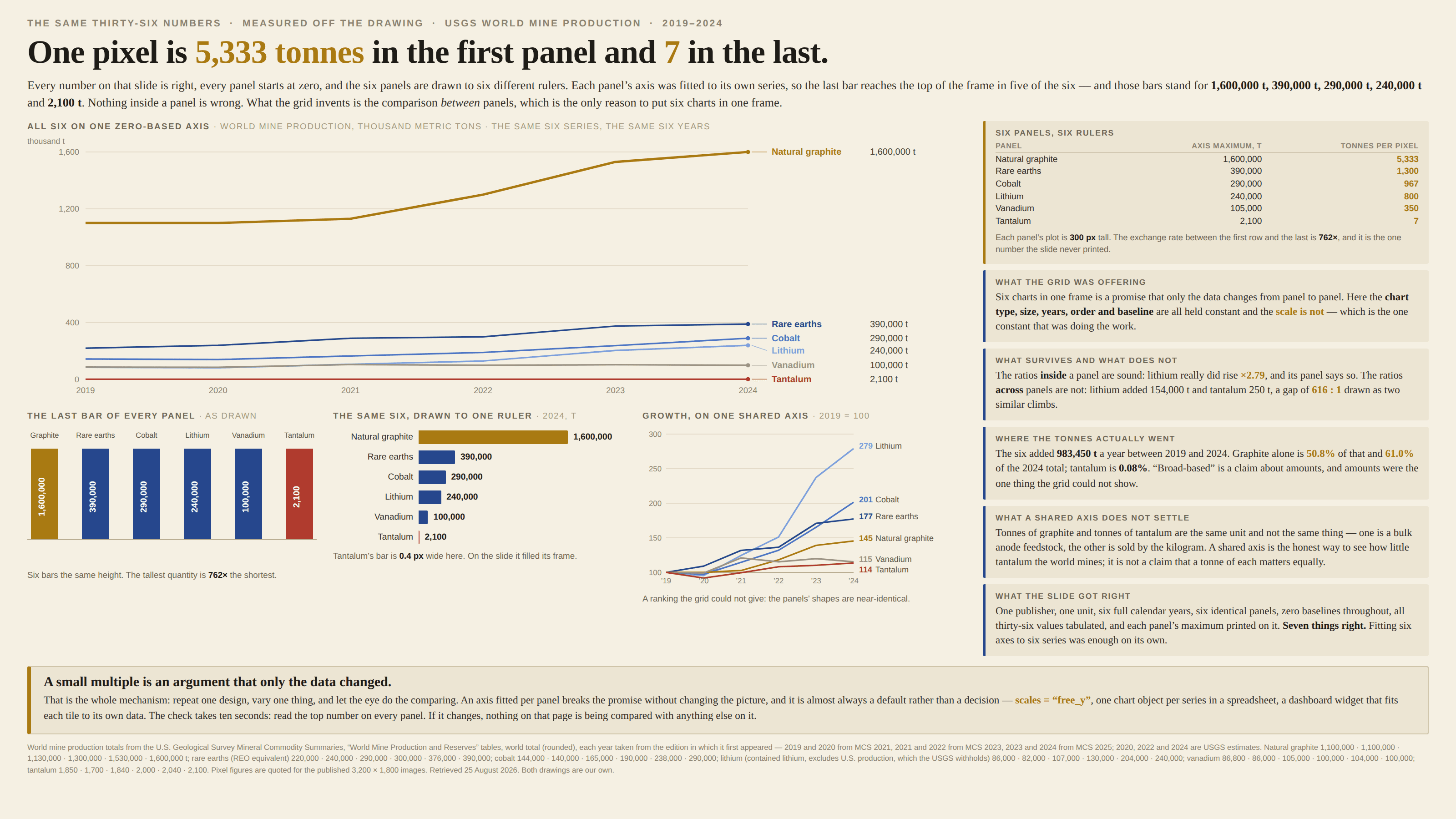
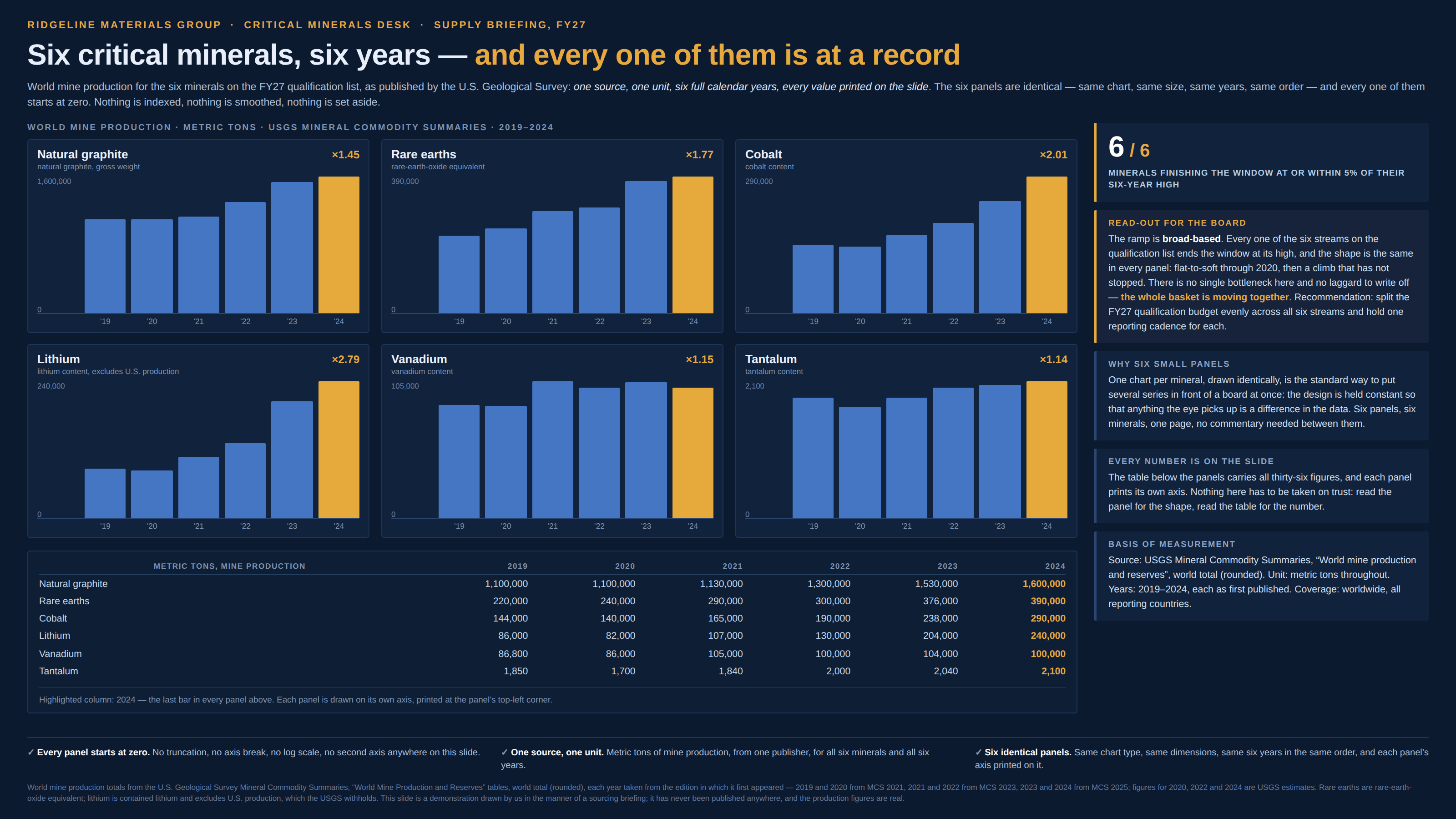
A small multiple works by holding everything constant except the data: same chart, same size, same years, same scale, repeated down the page, so that any difference the eye finds is a difference in the numbers. Fit each panel’s axis to its own series and the last of those constants quietly goes, while the picture looks exactly as it did. Every panel is now drawn to its own ruler, so a bar that reaches the top of one frame and a bar that reaches the top of the next are the same height and not the same quantity, and the comparison between panels — the only reason to put the panels in one frame — is invented by the layout. The panels are not individually wrong, which is what makes it hard to see: each is a correct chart of its own series, and the ratios inside a panel survive. It is the ratios across panels, the ones the grid is silently offering, that are a fact about the autoscaler.
How to spot it
- Read the axis on every panel, not just the first one. If the top number changes from panel to panel, no two marks on the page are drawn to the same ruler.
- Panels with no axis numbers at all — a sparkline row, a tile grid, a dashboard of little charts. Autoscaling is the default almost everywhere, so assume it happened until the page says otherwise.
- Every panel’s biggest mark reaching the top of its frame. Real series rarely peak in the same year and never peak at the same size; an autoscaler makes them all peak at 100% of the frame.
- The quietest series looking as busy as the loudest. A panel with nothing happening gets its wiggle stretched until it fills the frame, so noise arrives drawn at the same amplitude as signal.
- Take one panel’s axis maximum and divide it by another’s. That number is how much more a pixel is worth in the first panel than the second, and it is the exchange rate the grid never printed.
- Ask whether the axis was fitted to zero or to the data. Fitted to the data it is also a truncated axis, once per panel, and the two crimes compound.
- The library default: ggplot2’s scales = "free_y", one chart object per series in a spreadsheet, most BI tools’ small-multiple widgets. Free scales are usually a setting nobody chose.
The fix
The shared scale is not a nicety of small multiples, it is the whole mechanism — so the first answer is one zero-based axis for the entire grid, drawn once at the edge. If that flattens five panels into a line along the bottom, the flattening is the finding, and it is a finding the free-scale version was hiding rather than solving. Then ask which question the grid is for. If it is about amount, keep the shared axis and let the giant be a giant. If it is about growth, index every series to a common base year and share that axis instead, printing each panel’s level in the corner so nobody mistakes a rate for a size; that is a different chart of the same data, and saying which one you are showing costs a line. Where a series genuinely lives orders of magnitude below the others, give it its own panel at its own scale and separate it visually — a rule, a gap, a heading that says the scale changes here — because at that point they are not a small multiple, they are several charts that happen to share a page, and the reader deserves to know which they are looking at. And if free scales are unavoidable, at minimum print each panel’s maximum large enough to read and repeat the unit on every panel, since the axis maximum is the exchange rate, and a grid that hides its exchange rates is asking to be read as a comparison it cannot support.
In the gallery