All techniques
Framing & context
The shrinking yardstick
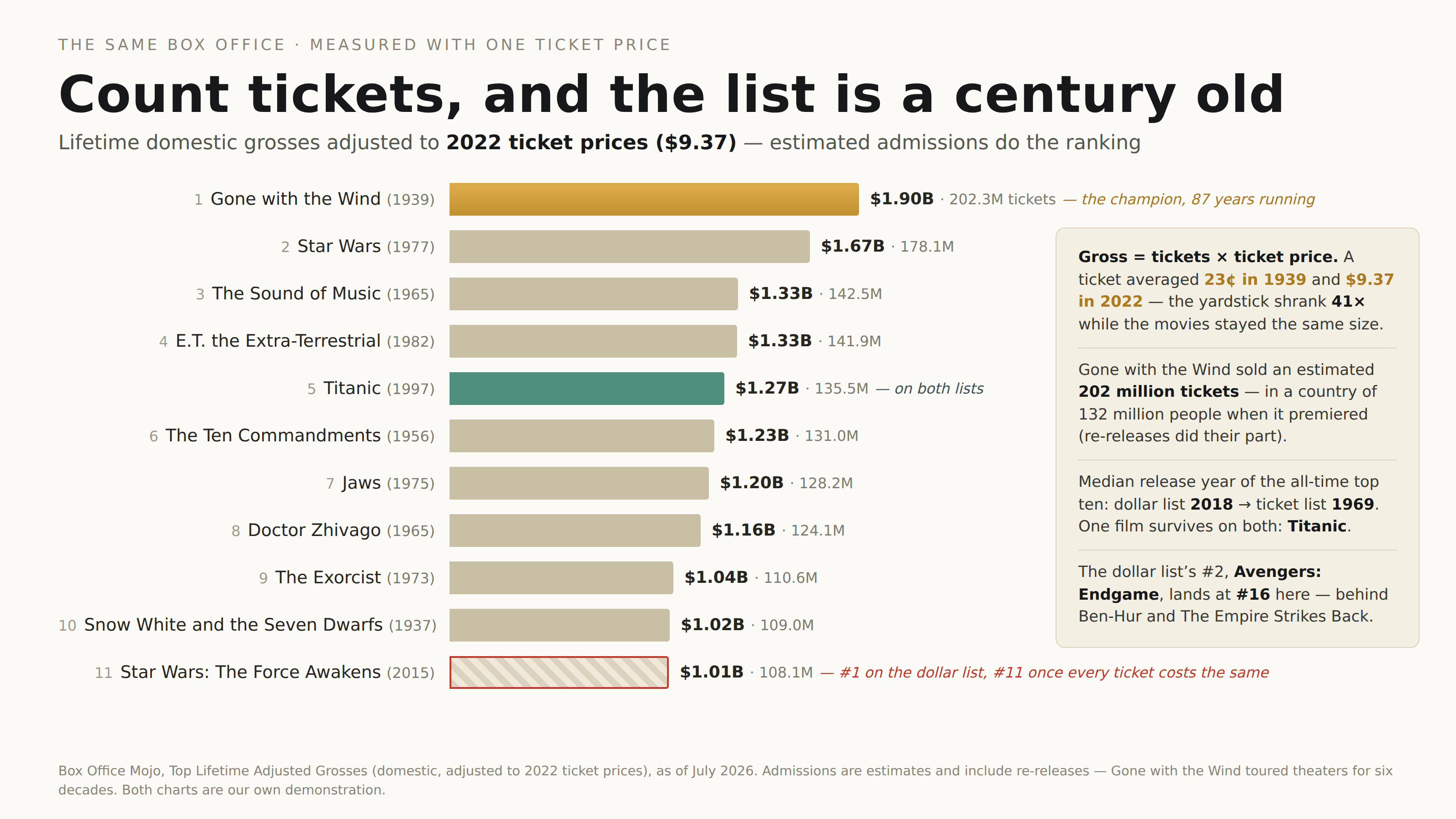
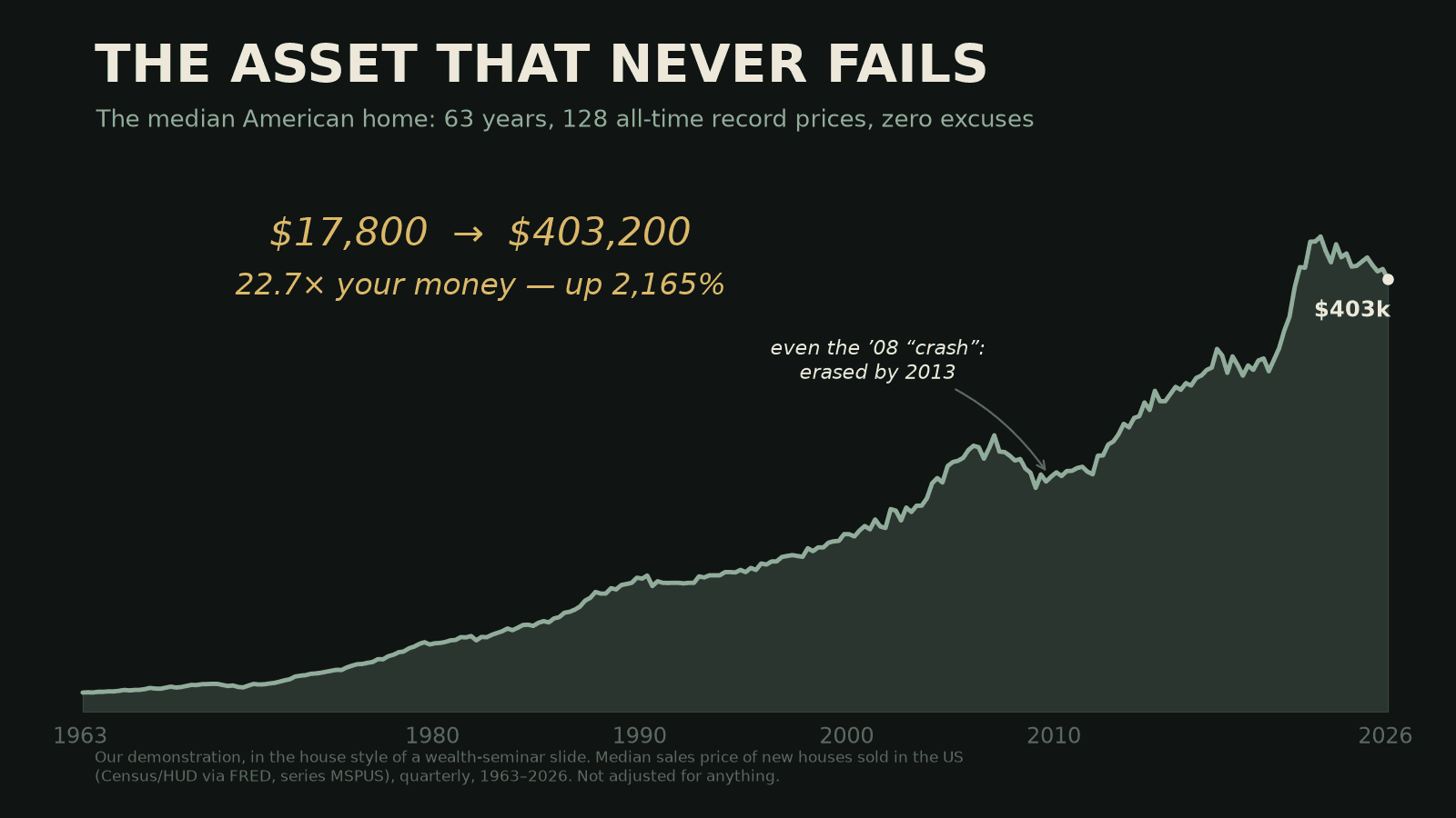
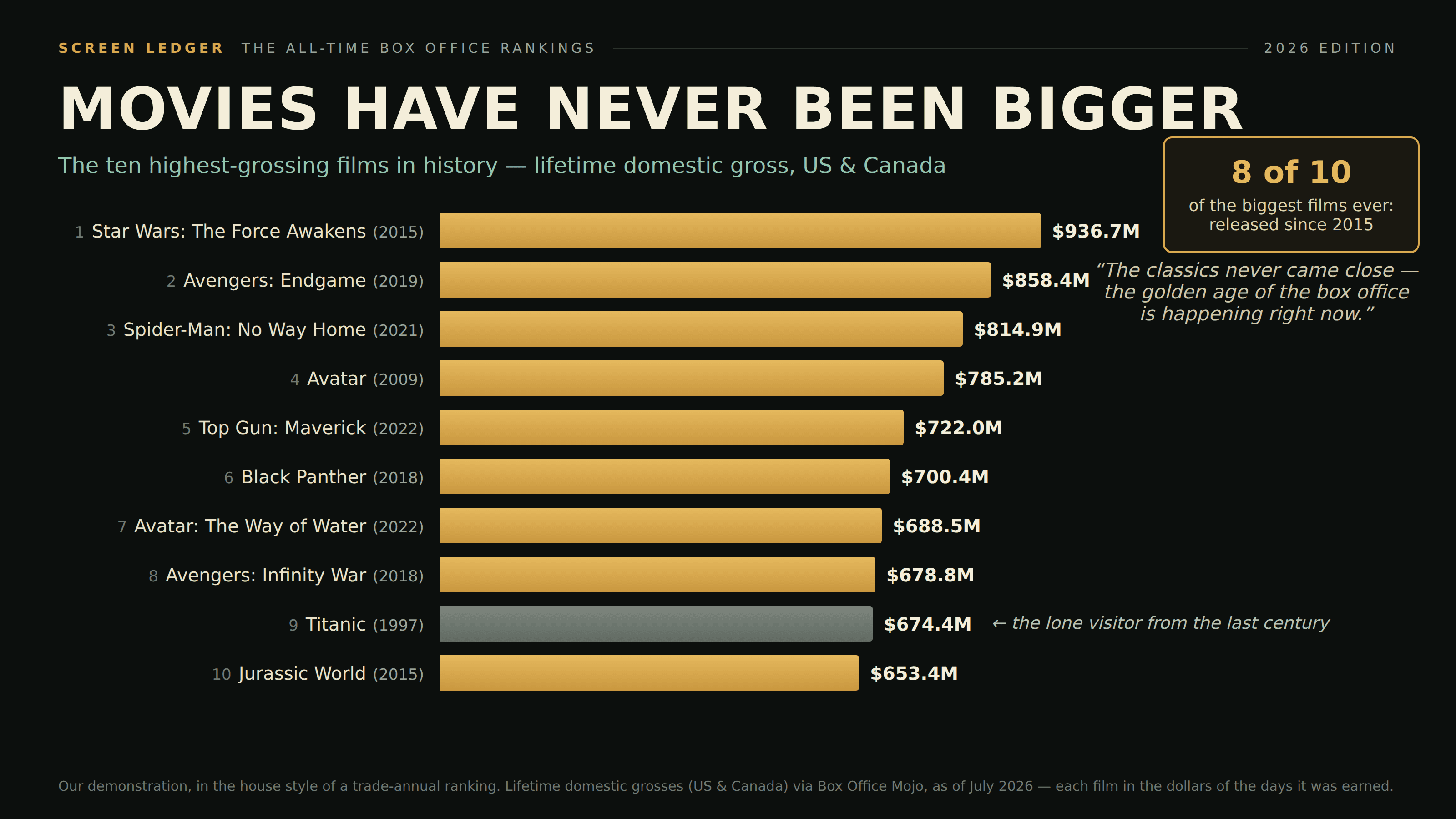
Every year is a record year when the dollar does the climbing.
a.k.a. nominal vs real · money illusion · not adjusted for inflation
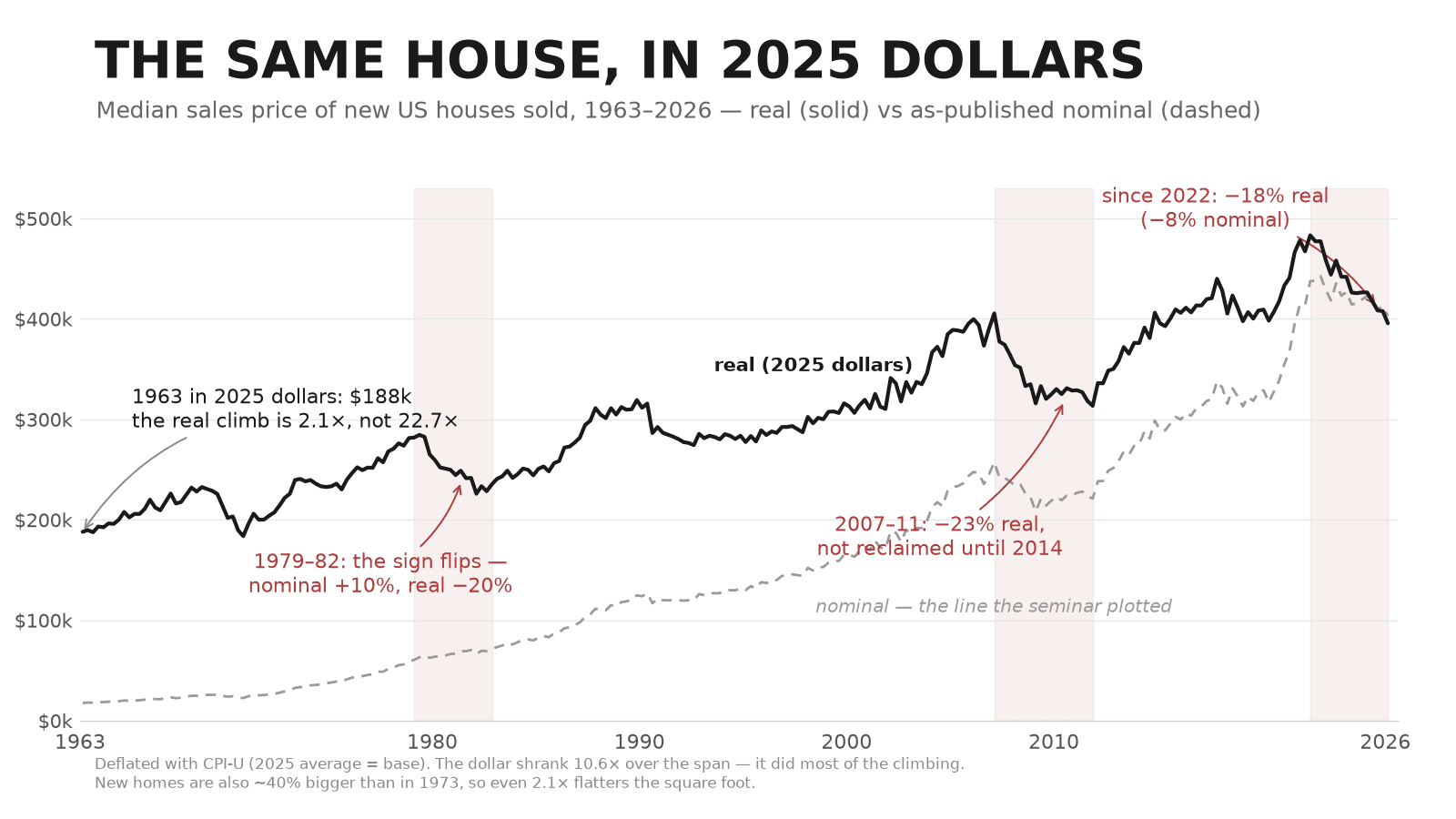
Plot decades of prices in the dollars of their day and the line can only soar — the measuring unit itself loses value every year, so “all-time high” comes free with the passage of time. A long span of nominal dollars is mostly a chart of inflation wearing the data’s clothes.
How to spot it
- “Record high” claims about any dollar amount measured across decades.
- No “real”, “inflation-adjusted”, or “constant dollars” anywhere on the chart.
- The series crosses the 1970s — the era that turns any nominal line into a hockey stick.
The fix
Deflate to constant dollars and say which year’s. If the story survives in real terms, it was a story; if it doesn’t, it was the CPI.