All techniques
Size & scale
The radial bar chart
The value sets the angle. The ring sets everything else.
a.k.a. circular bar chart · the race track chart · radial column chart · the ring chart · progress rings · coord_polar · the bar chart bent into a circle · concentric arcs · the activity rings · polar bar
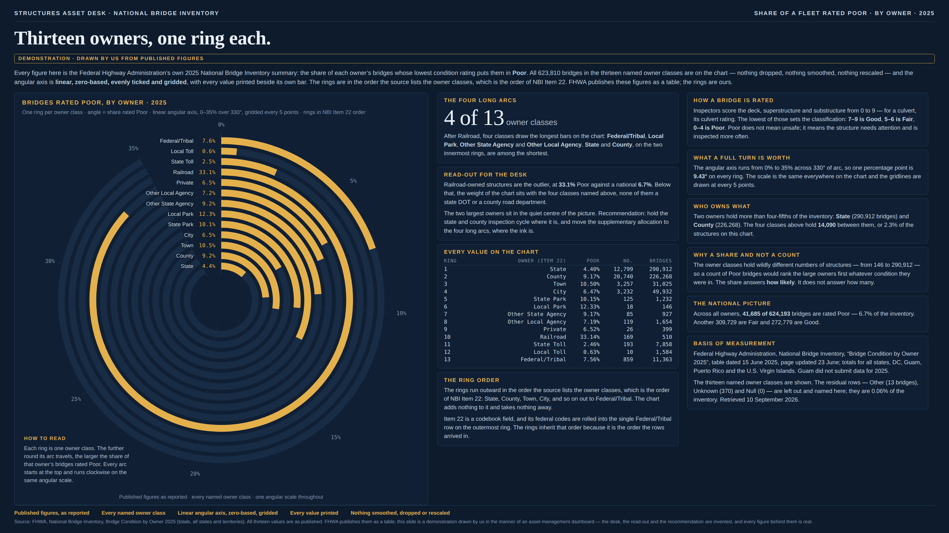
Bend a bar chart into a circle and each bar becomes an arc on its own concentric ring. The value still sets the angle, honestly and exactly — but what the reader measures is not the angle, it is the ink, and the length of an arc is its radius times its angle. So every bar on the chart has been multiplied by its ring, and a ring is not data. It is a slot, handed out by whatever order the rows happened to be in: alphabetical, the order they came back from the query, the order the legend lists them, the sort somebody clicked. Two categories with the same number get different bars; a category with a smaller number gets the longer bar whenever it got the outer ring by enough. The exchange rate is the ratio of the two radii — on a thirteen-ring chart the outermost ring is routinely four or five times the innermost — and it appears nowhere on the page, because the chart has no idea it is applying one. Inside a single ring the arcs are perfectly comparable, which is what makes it hard to see: nothing is exaggerated, no axis is bent, every number is drawn to its own correct angle, and only the comparison between rings — the entire reason the categories were put in one picture — is a fact about the seating plan. Two neighbours share the room and are worth telling apart. “The radar chart” puts categories on spokes from a common centre and asks the reader to judge the area of the polygon they enclose; this one gives every category its own ring and asks for a length that has been multiplied by which ring it got. “The gauge” is the one-ring case with a needle on it. And the coxcomb or polar-area rose is the same family again with the knob turned the other way: there the value sets the radius, so the area grows as the square of it, which is “The area illusion” drawn in polar coordinates. The family resemblance that matters most, though, is to “The free-scale small multiple”: both hand the reader a grid of marks that look like one chart and quietly price a unit of ink differently in each cell, and in both the exchange rate between cells is the one number the picture never prints.
How to spot it
- Find two rings with the same number on them, or nearly. If one arc is plainly longer than the other, the difference you are looking at is the difference between two radii.
- Compute the exchange rate: divide the outermost ring’s radius by the innermost. That is how much more a degree is worth at the edge than at the middle, and no radial chart prints it.
- Ask what decided the ring order. Alphabetical, the order of the legend, the order of the source table, a sort somebody clicked — every one of those is a multiplier applied to the data by something that is not the data.
- Read the innermost ring. It has the shortest radius on the chart, so its bar is the one most likely to look like nothing, whatever its value; a category can be third-worst and nearly invisible.
- Look at the outermost ring with suspicion, not because it is wrong but because it is flattered. It is the ring that turns a middling number into the second-longest bar on the page.
- Count the turns. A full circle is the axis maximum, so the frame is choosing the scale — and anything past a full turn either wraps round on top of itself or gets pinned at the top, which is the clipped axis arriving in a second body.
- Notice that there is no shared baseline. Every arc starts at twelve o’clock on a different circle, so no two bars begin in the same place and none of them ends against a common ruler.
- Ask what a gap between two arcs means. On a bar chart the gap is a difference; here it is a difference in angle drawn at two different radii, which is not a quantity in any unit.
- The places they come from: a bar geometry sent through ggplot2’s coord_polar, the “radial bar” and “race track” widgets in ECharts, Highcharts, Flourish and most BI tools, and the activity-ring style of fitness and progress displays.
The fix
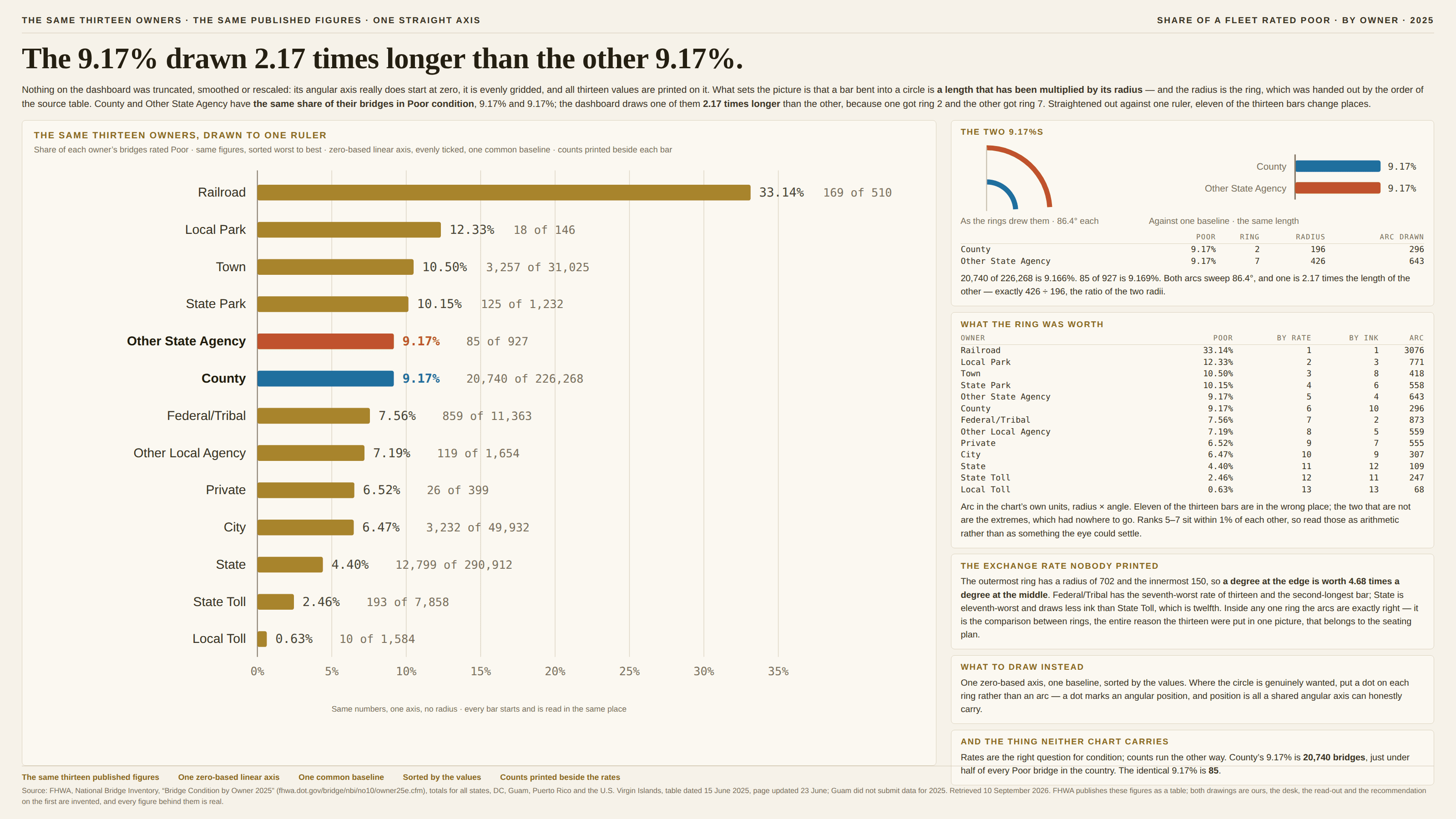
Unbend it. A sorted, zero-based horizontal bar chart is the same encoding with the multiplier taken out: one length per number, all of them starting at the same baseline and ending against the same ruler, in the order the values put them rather than the order the rows arrived in. That is the whole of the improvement and it is a large one, because length against a common baseline is the comparison people judge most accurately and a curved length at an undeclared radius is not a comparison at all. It costs the picture its symmetry, which is usually what the radial version was for; it buys a ranking the reader can read, room to print the numbers, and the ability to see a tie as a tie. Where the circle is genuinely wanted, the honest version of it is a dot on each ring rather than an arc, because a dot marks an angular position and position is all a shared angular axis can carry — no length is being multiplied, and the same ring-to-ring comparison becomes an alignment the eye can actually make. Keep the form outright where the quantity really is angular or cyclical — a wind rose, a chart of the hours of the day, a phase — since there the circle is the data rather than a decoration applied to it. And if a radial bar chart has to ship, at minimum draw the angular gridlines so the angles can be read, print every value on its own arc, order the rings by the values so the flattery at least runs the same way as the data, and say in the caption what a full turn is worth. A chart that has multiplied its data by thirteen different constants owes the reader a list of them.
In the gallery