The pizza pie whose slices add up to 274%
YouGov asked Americans which toppings they like — a pick-all-that-apply question — and the five most-liked answers got baked into a single pie chart that quietly sums to nearly three whole pizzas.
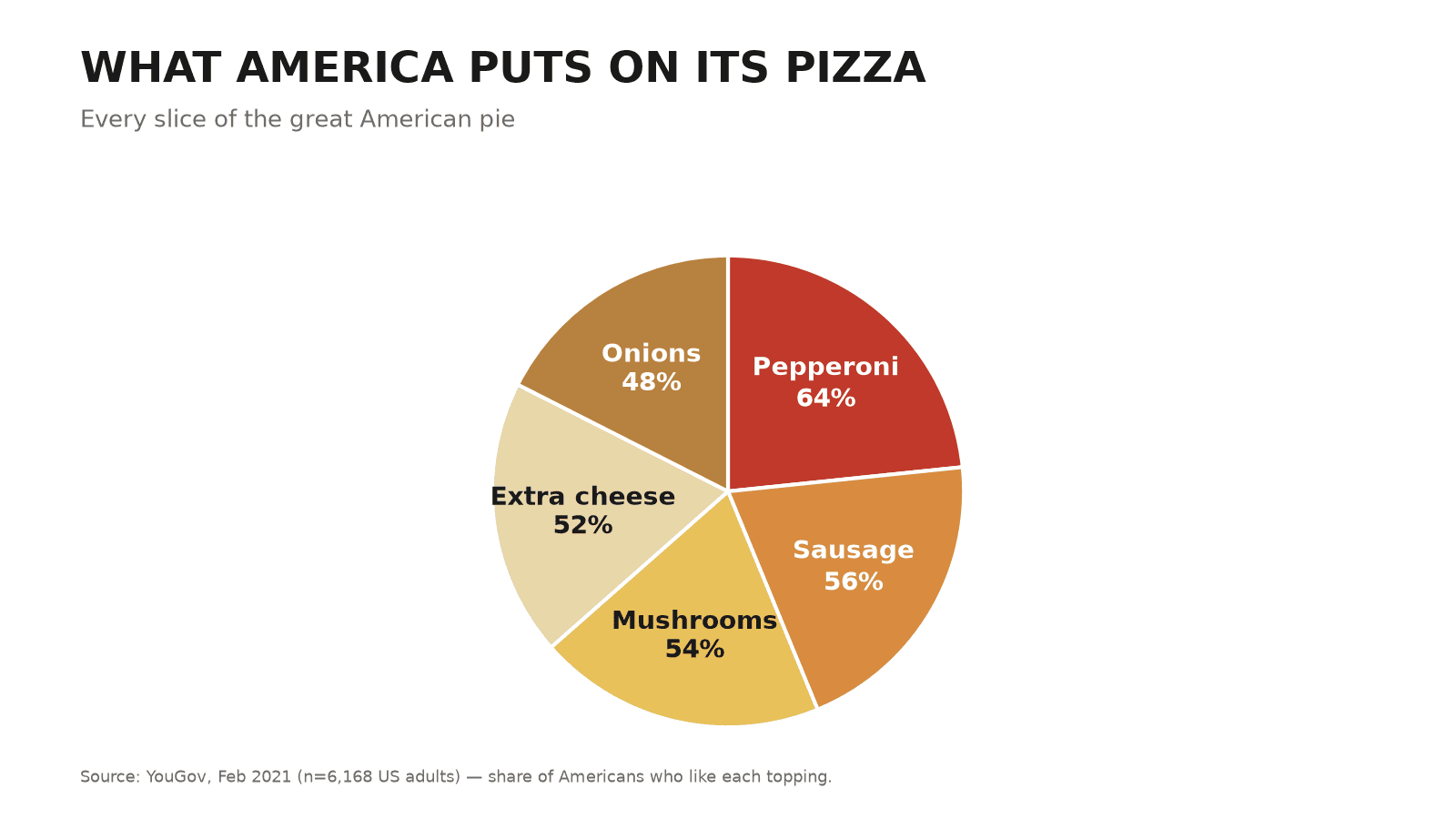
The claim
Here’s how America’s pizza preference divides up — pepperoni takes the biggest slice, and every topping fits neatly into the whole.
The trick
A pie chart is a promise that its slices are parts of one whole that sums to 100%. But this was a “select every topping you like” question, so 64% liking pepperoni and 56% liking sausage aren’t competing shares — a single person is counted in both. The five figures add to 274%. To force them into a circle, each slice was resized to its share of that 274, silently remapping “64% of people like pepperoni” into “pepperoni is 23% of the pie” — a number that means nothing and that no respondent ever gave.
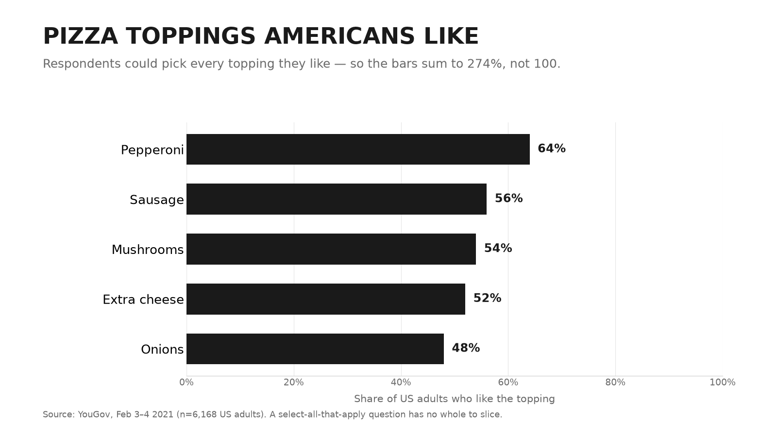
The honest version
On plain bars from 0 to 100%, each topping keeps its real value: 64% like pepperoni, 48% like onions, and the bars are free to sum past 100 because people were allowed to love more than one topping. Add them up and you get 274% — the honest signal that this was never a pie in the first place.