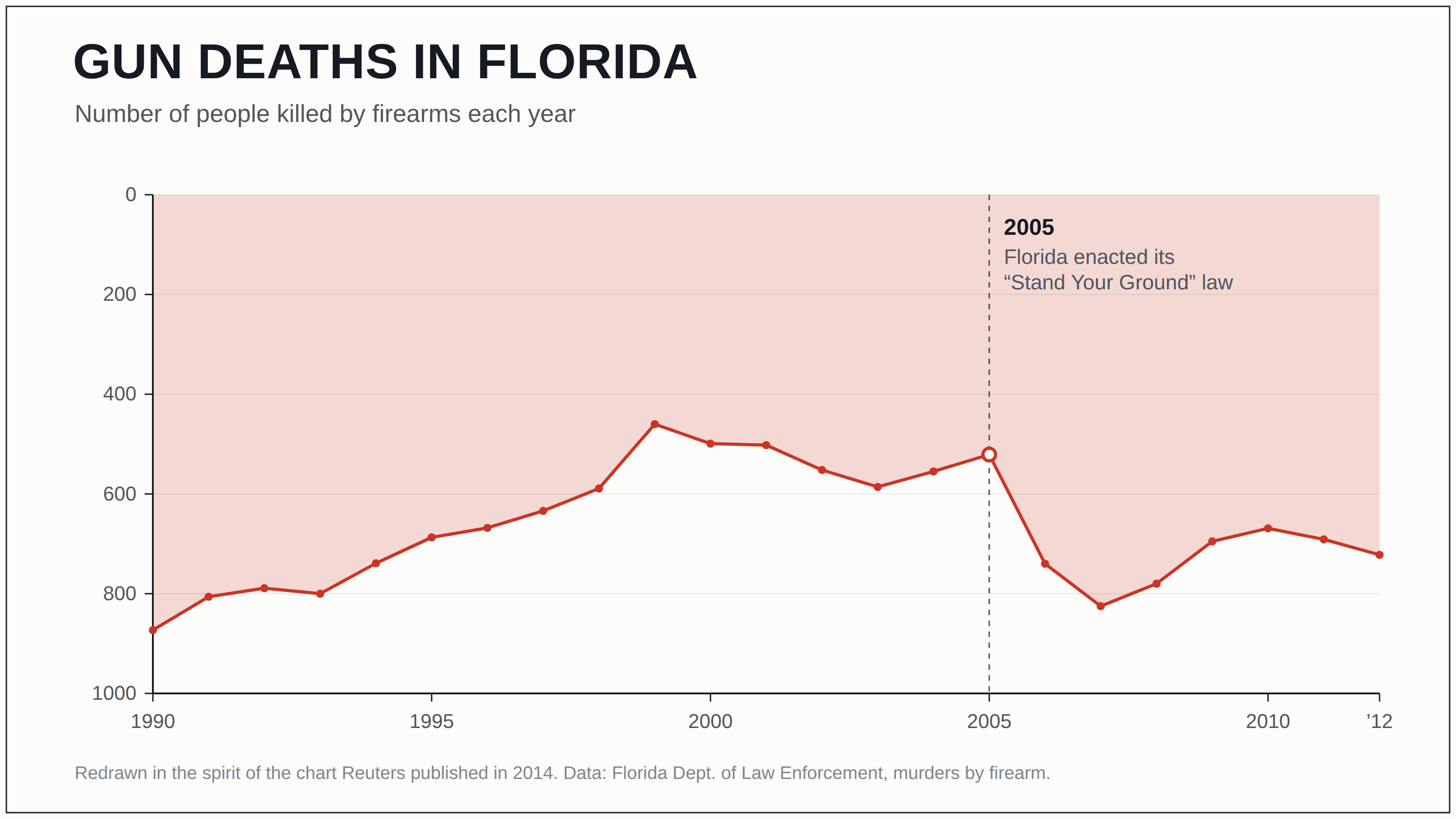
The Florida gun-death chart that ran upside down
Reuters plotted Florida’s firearm murders with the y-axis flipped, so a sharp rise in gun deaths after the 2005 “Stand Your Ground” law read, at a glance, as a plunge toward zero.
The claim
Florida’s “Stand Your Ground” law worked — gun deaths dropped off a cliff the moment it passed in 2005.
The trick
The y-axis is upside down: zero sits at the top and the counts grow as you travel downward, so a rise is drawn as a fall. Firearm murders went 521 → 740 → 825 in the two years after the law — a 58% jump — but because bigger numbers hang lower, the line dives toward the floor and reads as relief. The red area pouring down from the top finishes the illusion, framing the worst stretch on the chart as the calmest.
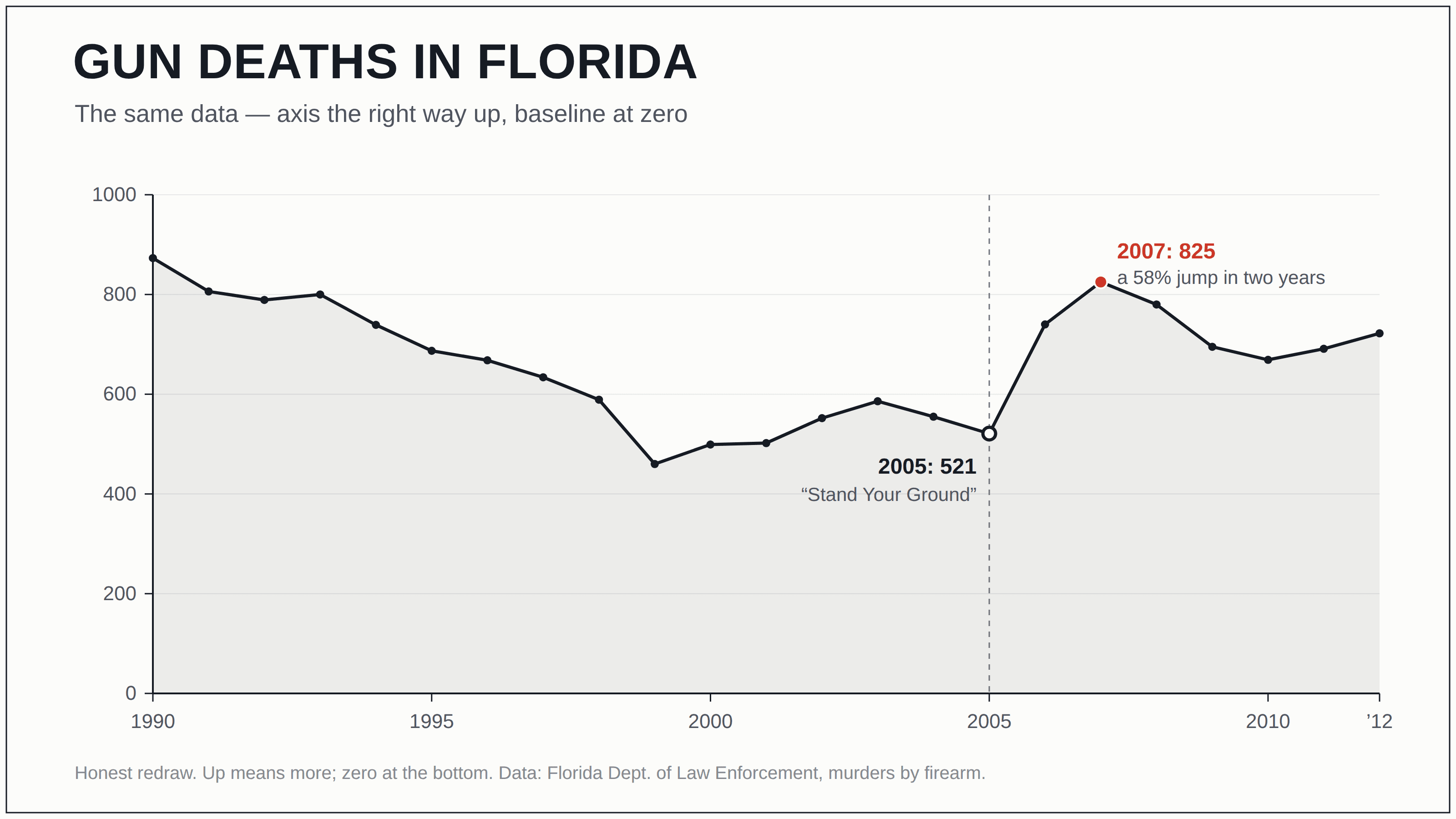
The honest version
Turn the axis the right way up — up means more, zero at the bottom — and the identical numbers tell the opposite story: a decade-long decline that bottoms out around 1999, drifts, then spikes hard right after 2005. “Up means more” is a convention doing quiet load-bearing work; remove it and the chart says the reverse of its own data. The Reuters copy alongside the graphic reported the increase plainly — only the picture disagreed.