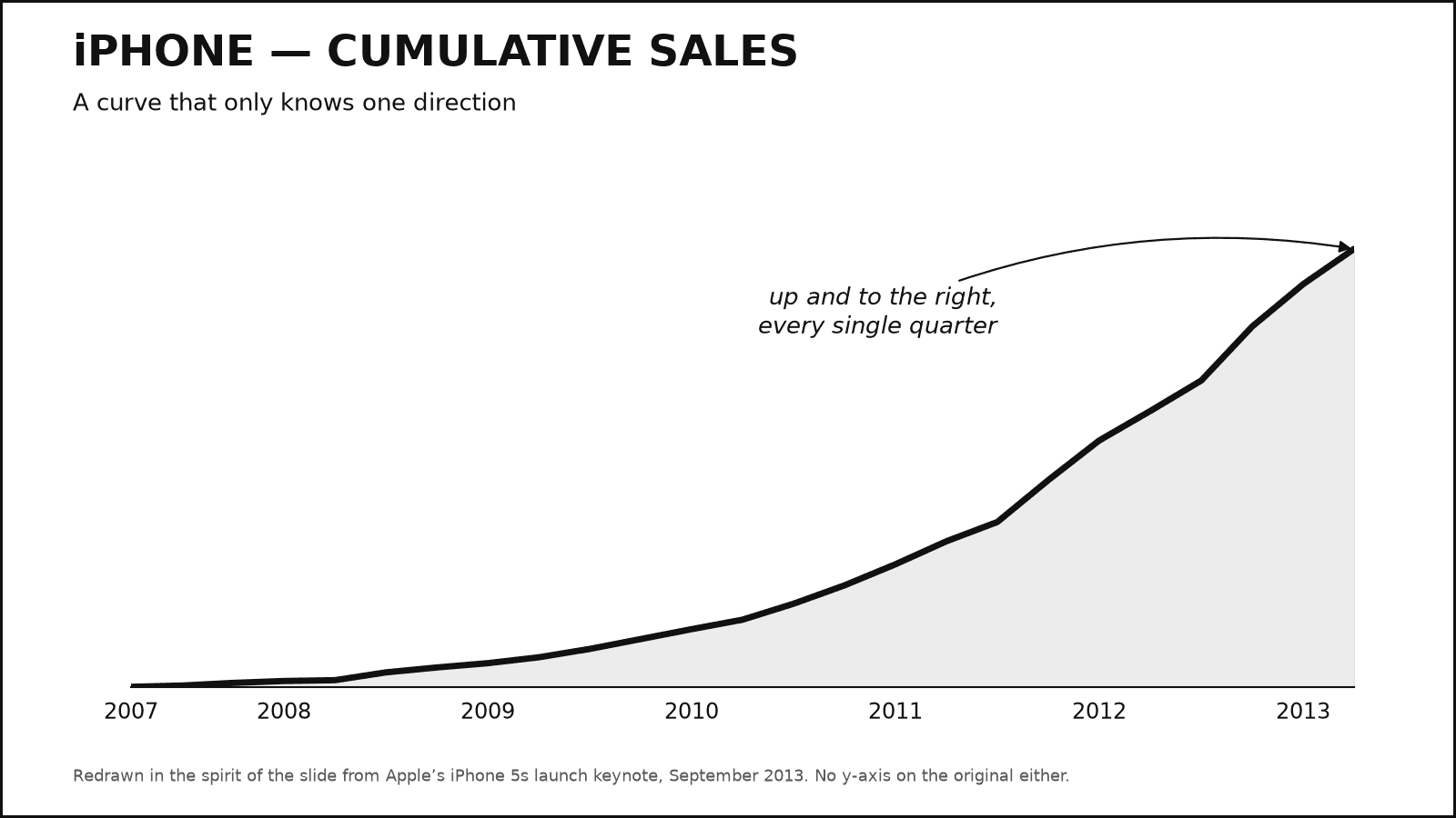
The iPhone sales curve that could not go down
Apple’s 2013 keynote plotted cumulative iPhone sales — a running total that rises by construction — right as quarterly sales fell for the second straight quarter.
The claim
iPhone sales are unstoppable — the curve gets steeper every year and never dips.
The trick
Two moves. Plot the running total instead of per-quarter sales — a cumulative series can only rise, so even the worst quarter in company history would still nudge the line upward — then drop the y-axis scale so nobody can check the slope. On stage in September 2013 the curve looked like pure acceleration; the underlying quarters had just gone 47.8M → 37.4M → 31.2M.
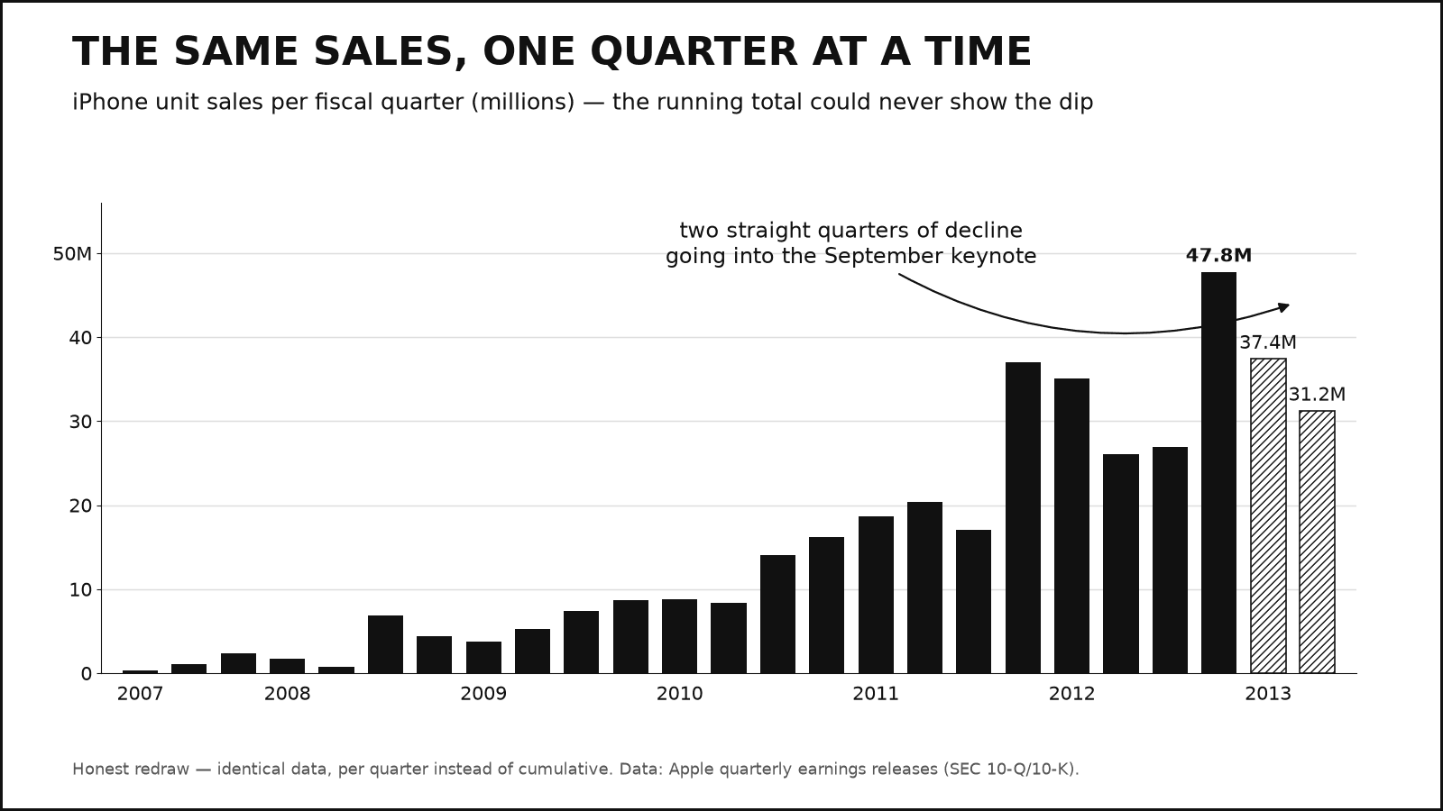
The honest version
Plotted per quarter from the same SEC filings, the data has texture the running total erases: a holiday peak every winter, two sequential declines going into the keynote, and year-over-year growth that had cooled from roughly doubling in early 2012 to about 20%. The six-year rise is real and impressive — the cumulative curve just made sure no other story was tellable.